Which is fine; it does the job and tells the story. That is unless you work in the creative industries, where your CV should be an extension of your portfolio and showcase your creativity and flair.
Recently I redesigned my CV in a clean, typographic, swiss style and since then have received positive comments on the more exciting layout I designed, even non-designer friends could appreciate it. It also makes me feel confident when applying for jobs that my CV will stand out in the sea of others.
To inspire you to do the same I have collected a few to show with a whole host more to be found on my dedicated Pinterest board for creative CVs - you can check that out here.
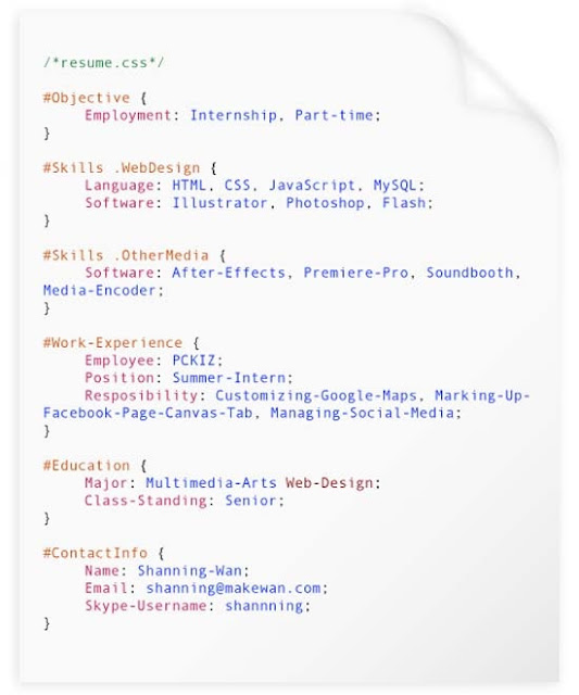
This first design is simple but the subtle design elements such as use of colour and type make it visually interesting. The layout also allows for a lot of information on the page without it feeling crammed.
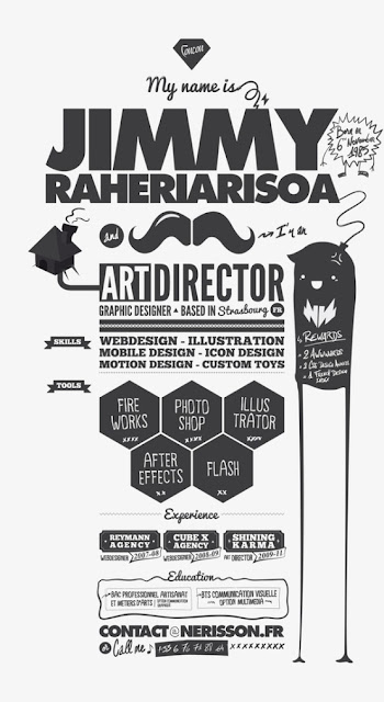
This CV has a mood board, casual feel to it with the added illustrations but gives a sense of personality to the design. The designer has stuck to black and white to counterbalance the "busy" layout.
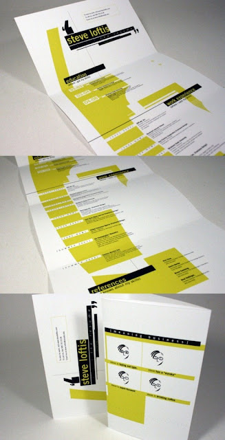
I love this design because of the timeline style and punctuation of lime green throughout to make this visually interesting. The level of thought and effort gone into this piece is evident and really conveys a sense of pride and care in this designers work.
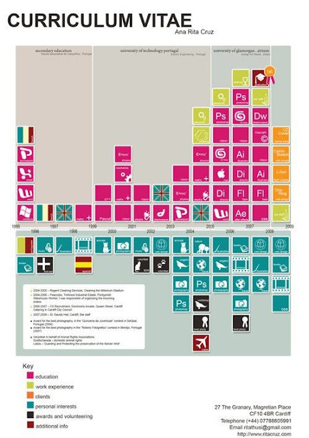
When researching creative CVs I found that info graphics were a prominent feature in many designs; this is not something I would consider myself but has lots of interesting potential for a designer who favours that area, such as this designer. I find this design quite confusing to read on screen but undoubtedly clever.
For more of my selected CVs or to find the original source for any of the above please visit my pinboard here. If you have any great examples yourself please send them my way.


