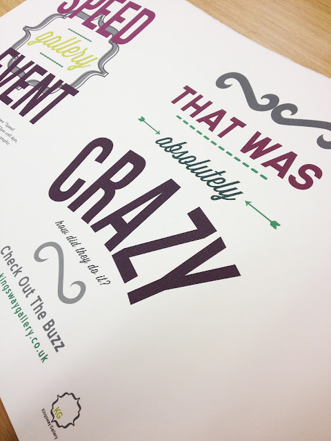
These are the posters being printed and prototypes. For the larger posters I wanted a screen printed look but wasn't able to actually get them screen printed in time, instead I used a thick 300 gsm cotton paper which allowed some bleed in the paper to create a great effect. I had to get this printed in uni using a huge A0 printer which was good to use because the quality is so concise and calibrated, unlike my printer. The project had a strong typography feel as shown in these images below.
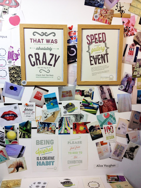
These are some images of the exhibition actually up on the walls, if you haven't read some of the previous posts it is based on a magnetic gallery concept and promoting the Kingsway Gallery on my uni campus. The idea is that people can stick what they want to the walls in order to inspire others all across the campus and promote themselves via the website. To illustrate the point of the piece I went a bit crazy, stripped my walls and covered the whole area in photos, sketches, postcards, polaroids and pieces torn out of magazines and this was the result. The final thing wasn't how I had envisaged, I wanted a cleaner feel to the exhibition but I think it makes an impression.


