photo imfresh2_zpsd65868bc.jpg  photo untitledcollection_zps84a740fd.jpg  photo phunk_zpsb7e679f8.jpg  photo havenbrochurecollectivecopy_zpsbcef5f41.png  photo rubanimages_zps7ead41bd.jpg  photo exhibinpractise_zps178c39b5.png  photo finishedruban_zpsd1229a75.jpg  photo tips_zps509f1619.jpg  photo degreeshowopening_zps0f4801ea.jpg  photo lemonstickers2_zps6d8fb7e9.jpg  photo interviewtips_zps56764e69.jpg  photo placement_zpsb679140e.jpg  photo graduation_zps13fcb4f1.jpg
Showing posts with label Typography. Show all posts

Sunday, December 23

Pinterest Picks


I love Pinterest; It's a great way to collate a digital mood board of inspirations and interests that can be simply updated, edited and shared. Many times I have been lacking ideas and turned to Pinterest for much needed inspiration, plus it can link you back to the original source, which is generally very useful. 

I am a big fan of typography, hand rendered type and anything remotely retro, which is shown in my Pinterest picks below. If you want to see any of these pins and other similar images follow my "Inspiration" board here.


Possibly one of my favourite pins to date, this simple design showcases type and photography together in a lovely nostalgic way. Although cheesy, I think the message within is also useful to remember.


Similar to the design above, this image touches on the "Hipster Branding" fashion with beautifully constructed type and simple vector shapes.


This image has a Nike feel about it to me, I like the offset effect used to suggest this has been screen printed or similar.


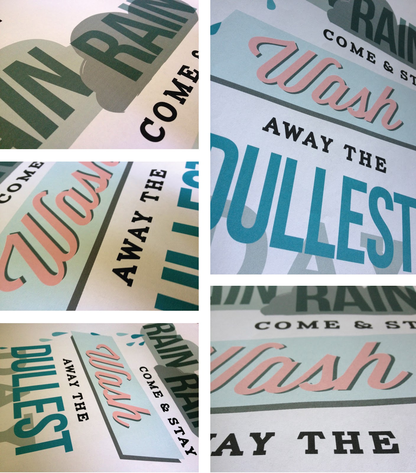
I so wish I was talented at hand rendered type like this image above. I like seeing the pens and paper scattered around the side of the page which shows that great design is not always reliant on digital methods.


I just like the simplicity of this hand painted sign and the angle of the shot.

Monday, November 12

Graphic Designer Games

My friend Nic has recently started her MA in Design and to showcase and organise her research has begun blogging her notes. Her blog is packed full of fascinating articles (see it here). One particular post about a logo guessing game (see it here) really intrigued me and got me thinking about other graphic designer games that were available (and also everybody likes games).

Nic spoke about Logo Quiz on her blog which is available for iPhone, iPads and Android devices, the premise of the game is to guess the famous brand from a fragment of the icon. A similar online version of the game is "Famous Logo Quiz"; It's quite an easy game with 30 logos to guess that everyone should be able to get a few of.


Similarly is the Sporcle quiz of corporate logos where you are given 6 minutes to guess all 36. I managed to get 23 if anyone thinks they can beat that, see it here. Sporcle is also a great quiz website for thousands of other genres and well worth checking out.


"Type Connections" is my favourite of all the games and works like "Blind Date" for type. You choose a "main character" and a partner then send them on a date to test compatibility. The funny commentary that accompanies the game really makes it entertaining but educational too as you can see which typefaces go together in "meet the pairs".


The font game, as you can probably guess, is about guessing fonts and I found this game really really challenging. If  you're a typography nerd and you think you can guess all 34 have a go here.

A much easier version of this game if the font shoot out game where you have to shoot the type the game asks you to select, unlike the font game, you have 3 lives and it's a bit more "game like" with a score board and the shooting element. Play it here


So have fun procrastinating with some useful and fun design games.

Friday, October 26

"Scripts" & Hand Rendered Type

Last week I got a copy of "Scripts" by Stephen Heller and Louise Fili, it was a book I had wanted for a while and eventually decided to buy from Amazon as it was pay day. The book is a fantastic example of vintage typefaces and elegant lettering from what the book describes as "design's golden era". The book itself is a whole selection of ads, notes, book covers and hand writing complied with useful notes and information to put the designs in context.

Another reason I decided to get a copy of "Scripts" was for my own personal project of developing my hand rendered type skills. I will be the first to admit that I am not naturally talented at drawing typefaces, but after looking at little more into the work of Jessica Hische I was convinced it was something I wanted to be good at.

A few months ago I created a campaign about lemons to send to design companies I really liked and admired. Although I received some positive responses I still don't have a job within the design industry, however, I have been playing around with ideas for a new self promotional campaign and I am hoping hand rendered type will give the project enough of a "wow factor" to land me that perfect job.

These are some photos of "Scripts" by Steven Heller and Louise Fili, a much recommended book. You can get a copy here.


Monday, October 22

Fashion Brief

I have been having a bit of a blog break recently as applying for jobs doesn't make for very interesting reading and I'm starting to bore myself talking and obsessing over applications, emails and CVs. Although I haven't been actively seeking employment for a really long time (about two months) it certainly can be demoralising when people don't call back and you need to come up with renewed enthusiasm.

With this in mind I was very pleasantly surprised to find an email in my inbox last week asking me to participate in a brief as part of the interview process for a well known clothing company that were known for their boots (which I now want a pair of) and their links to New England. The brief was to creative five t-shirt designs, two heritage themed and two illustrative "earth keeper" designs that related to the importance of the environment.

The brief sounded perfect as the heritage part of the brief was typography based and influenced by vintage signage, two things I really like and use in my own work. So I set to work researching, sketching and coming up with some designs that would reflect the nature of the company; something I could visualise on their t-shirts.

With this brief I tried to give the "client" what they wanted and reflected their company and then some designs that were a little more outside their comfort zone in the "earth keeper" illustrations as I was encouraged to be a bit more inventive. The deadline was this morning so I sent a PDF of the designs and explanations to the company last night, I think the designs I created were suitable and creative but wether I'll be invited to go further in the interview process? I'm not sure.

Anyway, here are a few pictures of the designs and works in progress.


Tuesday, August 21

Found Designs #3

Following previous posts along a similar theme (see here & here) I have collated more of my iPhone photos into a "Found Designs" blog post. These posts, as implied, are interesting illustrations, packaging and typography examples I have found while out and about.


My favourite designs here are a postcard from Aberystwyth using old style typefaces with an impressionist style painting to give a suggestion of the vintage sea side era.

A beautiful typeface on a memorial plaque I came across while walking my dog.

Interesting packaging design for some chocolates. The box uses foils to give the box a sense of luxury in contrast with a modern style of the package and typography.


Monday, July 2

Found Designs #2

Following on from my initial post on the subject of found designs, I have chosen a few of my favourite of my latest iPhone photos taken while out and about. As I said before, I am constantly taking photos of things that inspire me and can be used later, from book covers to packaging and more.

For me, it is important to be aware of design in everyday life; looking at new design styles that can be learnt and applied to new projects later on. This is important to keep my working looking fresh and not risk repetition in my portfolio.


Wednesday, May 23

Brit Project

In my experience as a graphic designer I have learnt that there will always be one project that you dislike, no matter how much you do to it will always be "the one you don't like". This project is that one I don't like.

The project itself is about making and breaking stereotypes of Brits and looking at the achievements of British people in the field of sport, music and engineering. At the start of the project I had a vague idea of what I wanted but I knew it was going to be typographic based as that was a part of my portfolio that wasn't developed.

As I got into the research and development everything was going great until it came to designing; nothing worked. For ages nothing was working. Until eventually I pulled it together into something just in time for the hand in. Although I don't like the project, it was a useful exercise it experimentation, research and refinement (which I did loads of). Hopefully this project will act as a lesson to myself to stop and come back to something instead of just trying everything to get it to work without thinking about what it means.


Friday, March 30

D&AD Rain Poster

About a month ago, Erik Kessels of KesselsKramer invited students from northern universities to design a poster promoting rain. This forms part of his northern lecture on April 5th in Manchester for the D&AD. The brief was to make rain "attractive" without being sarcastic; the brief seemed pretty appropriate to me as whenever I am in Manchester it always seems to rain.

Any award by D&AD has such a sense of prestige, so I definitely wanted to enter something. I intended to use typography as the poster would be forming research for another project I am working on also based on type. When devising concepts for the project I was influenced by the work of Saul Bass as he is well known for his combination of type and imagery to great effect.

I decided to base my poster on the children's nursery rhyme "Rain, rain, go away" but making the rain into a positive feature. The poster is intended to be emotive in the way that the clouds behind "rain" look although they are just about to pour down and "wash" looks like a 50's launderette sign. The Saul Bass elements of shape and typography have been added to create further impact to the statement.

After Easter break I want to get the poster screen printed after some adjustments, I don't feel like it is totally finished and needs a lot of work yet, but hopefully will translate well on print. These are a few images as it stands.


Saturday, February 18

Postcards

As usual I have been really bad at keeping my blog updated, so i'm trying to keep it updated more often. Anyway, as I have said in a previous post I have been working on my exhibition that forms part of my "Identity Design" module. The brief was to rebrand our uni campus and work on one specific area; I choose to rebrand the campus gallery which is hardly used and is such an awesome space. The main concept is using magnetic strips to allow students to put their work up or anything that inspires them, in an informal way that isn't abrasive and can be easily changed, to complement this idea I created a website, promotional post items, stickers, posted promotions, posters and a style guide.

These are some pictures of the postcards to be used as promotional items, inviting people to visit the website and generate publicity for exhibitions at Kingsway Gallery. I had them printed at moo.com which are usually great and super fast, one of the postcards was slightly smudged but generally the print quality was pretty good. Managed to get my SLR back from my brother so here are some better quality photos.


Exhibition In Practise

As I have been talking about a lot on this blog lately I have been making an exhibition, these are a few photos of it actually up on the walls. They are just iPhone photos so I will hopefully replace them with better versions when I get back into uni next week.

These are the posters being printed and prototypes. For the larger posters I wanted a screen printed look but wasn't able to actually get them screen printed in time, instead I used a thick 300 gsm cotton paper which allowed some bleed in the paper to create a great effect. I had to get this printed in uni using a huge A0 printer which was good to use because the quality is so concise and calibrated, unlike my printer. The project had a strong typography feel as shown in these images below.


These are some images of the exhibition actually up on the walls, if you haven't read some of the previous posts it is based on a magnetic gallery concept and promoting the Kingsway Gallery on my uni campus. The idea is that people can stick what they want to the walls in order to inspire others all across the campus and promote themselves via the website. To illustrate the point of the piece I went a bit crazy, stripped my walls and covered the whole area in photos, sketches, postcards, polaroids and pieces torn out of magazines and this was the result. The final thing wasn't how I had envisaged, I wanted a cleaner feel to the exhibition but I think it makes an impression. 


Sunday, January 29

Exhibition & Miscellaneous

I've been really bad at updating my blog and website at the minute because of all the deadlines going on, so attempting to counteract this by actually posting something. Once the deadline is handed in on the 6th of February and the exhibition is over (Februray 6th - 10th) then I'm going to update both with some new things and give them an image overhaul.

These past two weeks i've been working on some typographic treatments for my exhibition piece which is to rebrand our campus. The exhibition counts for 50% of the module so I really want it to be interactive and allow the user to add to the piece. On friday night I ordered some stickers and postcards to be used within the exhibition and hopefully just make it something people can have fun with. As of yet nothing had been properly printed for the exhibition so I only have some screen shots of the designs or rubbish print out versions. These are some of screenshots of things I have been working on which will hopefully look better screen printed on thick recycled card.


These actual designs are part of a series of seven postcards that will be sent out to design agencies as promotional pieces inviting them to Kingsway Gallery. Ideally I would of loved to get them screen printed to get that great texture and richness screen printing allows but time constraints means I had to just use the four colour printing process.

These are some examples of the stickers that will be used within the exhibition. The concept behind these were to promote a sense of positivity and interaction between the range of courses at Kingsway Campus. When the stickers arrive I am going to have about 100, so will probably end up with them just everywhere.

There are plenty more projects I am in the middle of right now so need to keep updating this blog with things i'm doing; working on branding, working on "live briefs" and trying to get more "live" work also dissertations, packaging, presentations and eating a lot of timeouts.