I visited Hereford degree show last year and was really impressed with the work on display, so I was eager to return again this year. Luckily I wasn't disappointed and the standard of work was really high, these are a pick of some of my favourites.
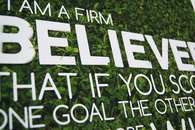
One of the pieces that I particularly liked were these football inspired typographic poster that appeared to be embedded in grass. I love the fresh simplicity of the concept that steers it away from cliche.
I had come to the degree show for the graphic design but was particularly impressed by the illustration show. I thought it was really interesting to look through the sketchbooks to indicate how the ideas had formed and the experimentation that had taken place.
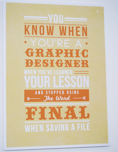
I loved this typographic poster as anyone who has been working on a design project will know these statements are so true!
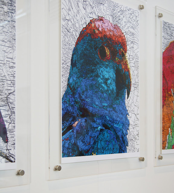
The image on the of the parrot has been printed over a map which creates a lovely texture.
This ad campaign for what I presume is a clothing company was interesting and capitalised on the instagram style trend that is widely popular at the moment. Clean typography gave this poster a youthful yet clean style.
A few people at the show chose to tackle the D&AD typographic brief for Ministry of Sound. Despite the repetition, all those that entered into the brief produced varying styles that approached the task in a range of exciting ways.
Overall the show was varied and dynamic considering the small number of students. I was really impressed with the illustration element of the show which had humour and impact in equal measure. I would advise anyone that has the chance to get down there and visit.
The show is running until June 23rd at Hereford College of Arts


