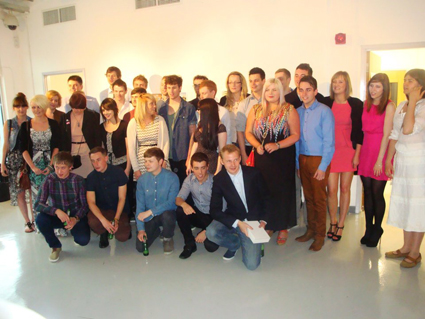
As I mentioned yesterday, the degree show exhibition is now underway after the opening night on Thursday. If you read this blog you might of seen me talking about my involvement in the show here.
Most degree shows have a catalogue with all the exhibiting artists in, a statement from them and an accompanying image. For our show we decided to have individual postcards, and it was my job to gather, edit, chase people up and make all 83 of these postcards, with the help of my good friends Nic and Lorna.
This was pretty stressful task on top of finishing my own degree as time was tight and there was lots to do. The whole process was a good experience in organising a large group of people and dealing with some difficult customers, which will hopefully be useful in industry.
Despite all this we did it and they came out looking really smart. I had been worrying on the drive up to the opening that they wouldn't live up to my expectations, but I was pleased with the clean style that linked in with our show branding perfectly.
Showing posts with label Degree Show. Show all posts
Saturday, June 23
Friday, June 22
Chester Degree Show Opening
First up is my own work which was an awareness campaign and brochure for a breast cancer charity called The Haven. You may of seen me talking about it here. The campaign will be situated in womens' dressing rooms and play upon the word "change" in terms of changing your clothes and changing and improving your health with The Haven. My exhibition space had a mirror, chair and clothes hook to make it appear like an actual changing room.
Type perfectionist James Matthews came up with a great book to teach student designers the basics of typography through fun exercises.
James Mellor worked on a project to change perceptions of tattoos and promote great tattoo design through the "Orange Tattoo Forum" with real tattooed oranges.
Pattern enthusiast Laura Edwards produced a range lovely of travel themed prints with appropriate props to match.
Alex Franklin masterminded a rebrand of the extreme sport parkour. He produced a range of artefacts to promote the sport as a beneficial activity for kids and teenagers,
A really interesting brief by David Yates; to encourage men to buy flowers for other men by explaining the meaning behind each flower and what it can symbolise.
One of my favourites of the show is by James Bingham. He undertook the YCN brief to create a picnic basket for M&S. The Japanese inspired pack included extensive examples of packaging and advertising and photography.
Adam Tomlin presented a rebrand of our campus with some exciting conceptual sculpture ideas.
Sophie Lou hand drew a series of prints and patterns in a geometric style to create an eye catching piece.
Michael Goldsworthy created a giant map of the UK using plasticine to explore childhood nostalgia. He asked visitors to add to the map by creating a mini model of happy memory in a relevant spot on the map. I love the tactile nature of this piece which had everyone crowded around on the opening night eager to add to it.
Emma Wilson rebranded a sweetshop using real props. These were in real danger of being eaten during degree set up so luckily some have survived to see the show.
Hayley Miles produced a range of typographic posters to promote "The Wizard of Oz" to a younger audience. The whole aesthetic of her exhibition tied in really nicely which made it look professional and slick.
Of course there are lots more exciting pieces to see in Graphic Design, Fine Art and Photography so do make sure you visit or look up some of these designers.
Overall it has been great to see these concepts form to now seeing them presented in the exhibition and the show has dynamic and bold feel to it due to the diversity of the work on show. And that pretty much concludes my three year Graphic design degree, all that is left to do now is wait for the results.

Tuesday, June 19
Hereford College of Arts Degree Show
The start of summer always signals the start of the degree show season; a chance for final year students to showcase their best work in an exhibition to the public and industry experts. If you follow me on twitter then you will of probably heard me banging on about my own show that opens this thursday. However, today I was focusing on another degree show at Hereford College of Arts.
A few people at the show chose to tackle the D&AD typographic brief for Ministry of Sound. Despite the repetition, all those that entered into the brief produced varying styles that approached the task in a range of exciting ways.
I visited Hereford degree show last year and was really impressed with the work on display, so I was eager to return again this year. Luckily I wasn't disappointed and the standard of work was really high, these are a pick of some of my favourites.
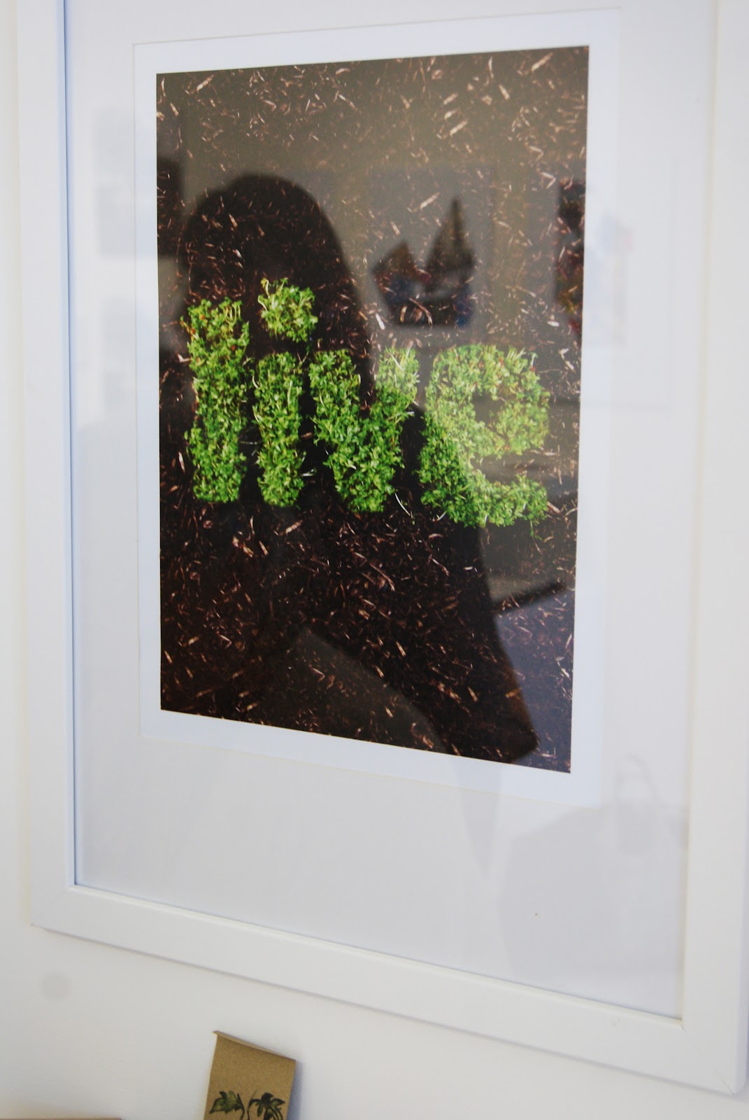
One of the pieces that I particularly liked were these football inspired typographic poster that appeared to be embedded in grass. I love the fresh simplicity of the concept that steers it away from cliche.
I had come to the degree show for the graphic design but was particularly impressed by the illustration show. I thought it was really interesting to look through the sketchbooks to indicate how the ideas had formed and the experimentation that had taken place.
I loved this typographic poster as anyone who has been working on a design project will know these statements are so true!
The image on the of the parrot has been printed over a map which creates a lovely texture.
This ad campaign for what I presume is a clothing company was interesting and capitalised on the instagram style trend that is widely popular at the moment. Clean typography gave this poster a youthful yet clean style.
A few people at the show chose to tackle the D&AD typographic brief for Ministry of Sound. Despite the repetition, all those that entered into the brief produced varying styles that approached the task in a range of exciting ways.
Overall the show was varied and dynamic considering the small number of students. I was really impressed with the illustration element of the show which had humour and impact in equal measure. I would advise anyone that has the chance to get down there and visit.
The show is running until June 23rd at Hereford College of Arts
Friday, June 8
Personal Development Plan
Yesterday I finally finished Uni! Completing our exhibitions was the last part of our final deadline so typically everyone was stressed but still making time to have a laugh. Getting to see everyones' exhibitions go up over the course of the two days was great because there is such variation in the work displayed. The exhibitions have now been locked up ready for marking, only to open again on June 21st for the public.
As part of the exhibition I had to include my PDP or personal development plan. This is a detailed account of my development as a designer during the course of third year, documenting everything I have done. I've been slowly adding to the document for a number of months but it's only now it has been printed that I can appreciate all the workshops, meetings, exhibitions, briefs, collaborations, competitions and events I went to/did/worked on/chaired. These are some images of the final PDP printed and bound.
Wednesday, June 6
Final Exhibition Set Up
Thursday the 7th of June marks the final part of my degree where I will be presenting work I have produced this year in an exhibition. The pressure to do a good job is high, especially when surrounded by some great pieces from other designers. Due to the jubilee weekend time has been tight to get the exhibition set up and ready in time for the 4pm deadline.
For my part of the show I will be presenting some work from a self initiated charity brief. The concept is to raise awareness about The Haven, a breast cancer charity, by situating a campaign in womens' changing rooms and playing on the word "change" in terms of clothes and changing your lifestyle choices. I will also include a brochure I designed as part of the same brief along with my business cards and other promotional items.
Due to the nature of my brief, I want to make my space look like a changing room to put the campaign in situ. With added props of a mirror, seat and coat hooks I hope to achieve this look and ensure a professional exhibition.
These are some images of the exhibition coming together, spending time at the printers and mess.
For my part of the show I will be presenting some work from a self initiated charity brief. The concept is to raise awareness about The Haven, a breast cancer charity, by situating a campaign in womens' changing rooms and playing on the word "change" in terms of clothes and changing your lifestyle choices. I will also include a brochure I designed as part of the same brief along with my business cards and other promotional items.
Due to the nature of my brief, I want to make my space look like a changing room to put the campaign in situ. With added props of a mirror, seat and coat hooks I hope to achieve this look and ensure a professional exhibition.
These are some images of the exhibition coming together, spending time at the printers and mess.
Friday, June 1
Degree Show
If you follow me on twitter then you have probably seen me talking about the degree show over the past few weeks. The exhibition requires months of prior planning on top of our already busy schedules to ensure that the show is presented in the best way possible.
I have been quite heavily involved for a number of weeks collating an image and statement from each exhibiting student, editing and adjusting it and then making it into an individual postcard. Luckily I have had the help of a crack team of individuals; Nic and Lorna, to help turn the postcards around.
I really wanted to get involved with the show because I could ensure the outcomes were to a good standard and something we could be proud to present. However, dealing with such a large number of people you don't know and can't rely on can be challenging, but ultimately rewarding when you eventually organise the situation.
The process has been pretty stressful at times when trying to get required images from certain people and trying to explain what DPI is to fine artists. Hopefully within the week the postcards will be sent off to print ready for the degree show and we will end up with some great promotional items.
These are some images of the degree show in progress. This week I have been painting my wall space, getting covered in paint and building my plinth (I made it myself, from scratch and using tools like a pro)
I have been quite heavily involved for a number of weeks collating an image and statement from each exhibiting student, editing and adjusting it and then making it into an individual postcard. Luckily I have had the help of a crack team of individuals; Nic and Lorna, to help turn the postcards around.
I really wanted to get involved with the show because I could ensure the outcomes were to a good standard and something we could be proud to present. However, dealing with such a large number of people you don't know and can't rely on can be challenging, but ultimately rewarding when you eventually organise the situation.
The process has been pretty stressful at times when trying to get required images from certain people and trying to explain what DPI is to fine artists. Hopefully within the week the postcards will be sent off to print ready for the degree show and we will end up with some great promotional items.
These are some images of the degree show in progress. This week I have been painting my wall space, getting covered in paint and building my plinth (I made it myself, from scratch and using tools like a pro)
Wednesday, May 30
Business Cards
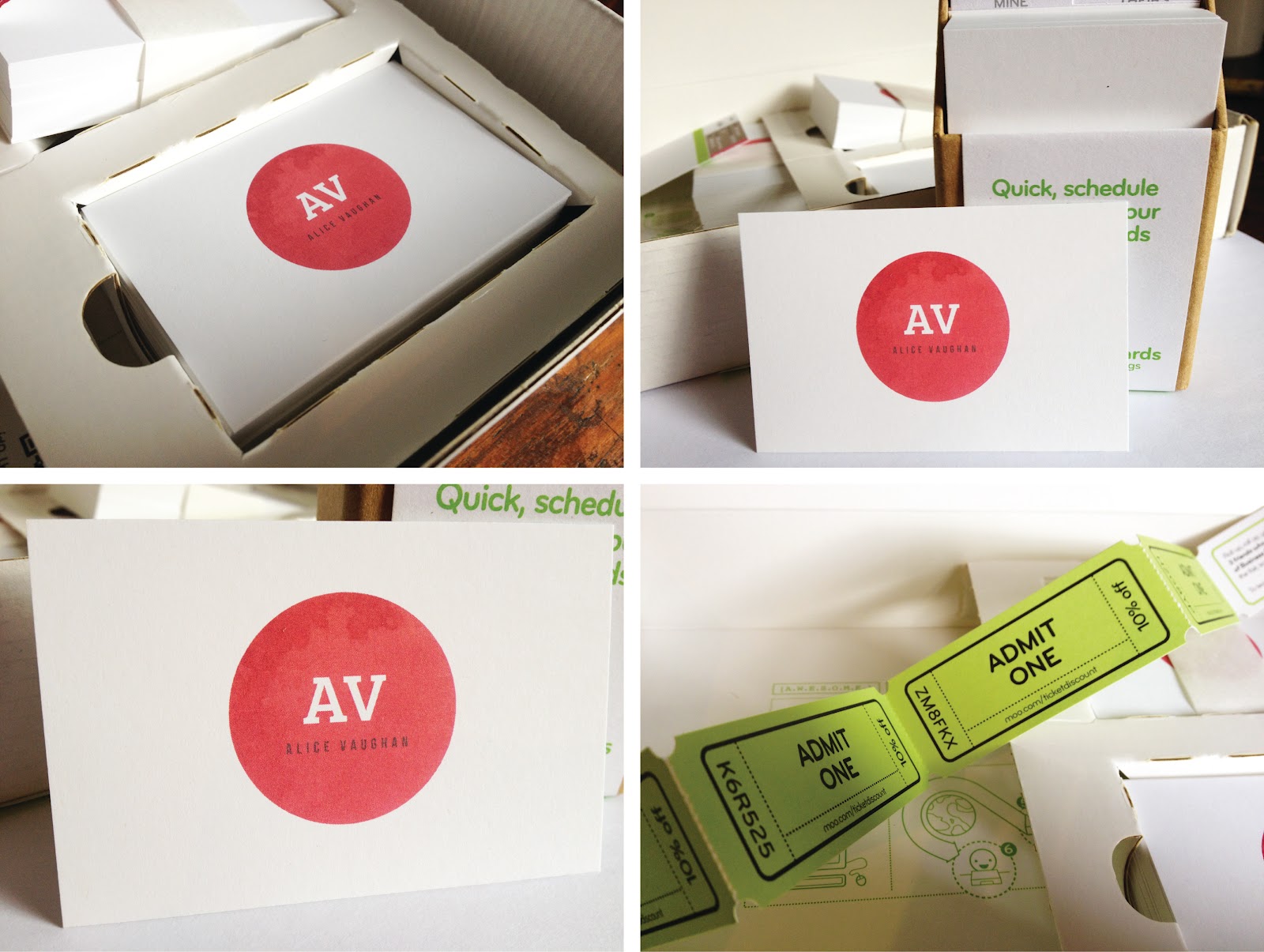
As the degree show approaches I have been collecting and ordering the various elements I need to make my exhibition. One of the things I ordered were my business cards, which arrived today. I had been investigating into business cards for some time as they have been on my to do list for months, but finally ordered them last week from uk.moo.com.
I have used MOO a few times before, most recently for my postcards, where some of the prints had been smudged. However, when they arrived today they were neatly packaged and the print quality was really clear and vibrant. I possibly went a bit overboard and ordered 200 so there would be plenty for the show.
I wanted the design to be simple but incorporate things that gave an indication of my style. The design is simple and clean but includes elements of texture; a prominent feature in my own work.
You can get 10% off your next order at uk.moo.com by using this code.
I have used MOO a few times before, most recently for my postcards, where some of the prints had been smudged. However, when they arrived today they were neatly packaged and the print quality was really clear and vibrant. I possibly went a bit overboard and ordered 200 so there would be plenty for the show.
I wanted the design to be simple but incorporate things that gave an indication of my style. The design is simple and clean but includes elements of texture; a prominent feature in my own work.
You can get 10% off your next order at uk.moo.com by using this code.
Tuesday, March 6
"Untitled" Degree Show Ident
For our final degree show in June the design committee, who are responsible for naming, funding and organising the show, have chosen to call it "Untitled". When I first heard this on monday I was pretty disappointed with the lack of imagination and thought that had gone into this choice. Students in third year, like myself, were invited to create an ident for the degree show, with the most popular design becoming the branding. With Chester being quite a small university it is vital our degree show branding attracts some attention and lets the public know about the great design being produced.
Despite the relatively generic name of "Untitled" it did allow a lot of freedom when designing an identity for the degree show. It was a great opportunity to create something, exciting, crazy and fun for our show that would make us stand out. With this in mind I chose to make something quirky and vibrant that illustrated "Untitled".
Subscribe to:
Posts (Atom)