photo imfresh2_zpsd65868bc.jpg  photo untitledcollection_zps84a740fd.jpg  photo phunk_zpsb7e679f8.jpg  photo havenbrochurecollectivecopy_zpsbcef5f41.png  photo rubanimages_zps7ead41bd.jpg  photo exhibinpractise_zps178c39b5.png  photo finishedruban_zpsd1229a75.jpg  photo tips_zps509f1619.jpg  photo degreeshowopening_zps0f4801ea.jpg  photo lemonstickers2_zps6d8fb7e9.jpg  photo interviewtips_zps56764e69.jpg  photo placement_zpsb679140e.jpg  photo graduation_zps13fcb4f1.jpg
Showing posts with label Illustration. Show all posts

Sunday, December 23

Pinterest Picks


I love Pinterest; It's a great way to collate a digital mood board of inspirations and interests that can be simply updated, edited and shared. Many times I have been lacking ideas and turned to Pinterest for much needed inspiration, plus it can link you back to the original source, which is generally very useful. 

I am a big fan of typography, hand rendered type and anything remotely retro, which is shown in my Pinterest picks below. If you want to see any of these pins and other similar images follow my "Inspiration" board here.


Possibly one of my favourite pins to date, this simple design showcases type and photography together in a lovely nostalgic way. Although cheesy, I think the message within is also useful to remember.


Similar to the design above, this image touches on the "Hipster Branding" fashion with beautifully constructed type and simple vector shapes.


This image has a Nike feel about it to me, I like the offset effect used to suggest this has been screen printed or similar.


I so wish I was talented at hand rendered type like this image above. I like seeing the pens and paper scattered around the side of the page which shows that great design is not always reliant on digital methods.


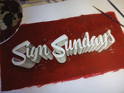
I just like the simplicity of this hand painted sign and the angle of the shot.

Monday, October 22

Fashion Brief

I have been having a bit of a blog break recently as applying for jobs doesn't make for very interesting reading and I'm starting to bore myself talking and obsessing over applications, emails and CVs. Although I haven't been actively seeking employment for a really long time (about two months) it certainly can be demoralising when people don't call back and you need to come up with renewed enthusiasm.

With this in mind I was very pleasantly surprised to find an email in my inbox last week asking me to participate in a brief as part of the interview process for a well known clothing company that were known for their boots (which I now want a pair of) and their links to New England. The brief was to creative five t-shirt designs, two heritage themed and two illustrative "earth keeper" designs that related to the importance of the environment.

The brief sounded perfect as the heritage part of the brief was typography based and influenced by vintage signage, two things I really like and use in my own work. So I set to work researching, sketching and coming up with some designs that would reflect the nature of the company; something I could visualise on their t-shirts.

With this brief I tried to give the "client" what they wanted and reflected their company and then some designs that were a little more outside their comfort zone in the "earth keeper" illustrations as I was encouraged to be a bit more inventive. The deadline was this morning so I sent a PDF of the designs and explanations to the company last night, I think the designs I created were suitable and creative but wether I'll be invited to go further in the interview process? I'm not sure.

Anyway, here are a few pictures of the designs and works in progress.


Friday, August 31

I'm Fresh #2

Recently I began my job search by sending out a letter and stickers based on a lemon concept to various companies (see it here). I wanted to create a campaign to send to these design agencies so that I would stand out from what I expect would be thousands of other potential candidates. 

The campaign was based around lemons with "I'm fresh out of university" being the main tag line on the stickers along with lemon illustrations and some lemon based puns. Luckily, I did get some response to my letters but to ensure these companies didn't forget me I began part two of the "I'm Fresh" campaign and sent out another package. 

The new package had to be bold, interesting and attention grabbing. To achieve these criteria I wrote another letter, included a CV, more stickers and a lemon then neatly packed it into a box and sent it off yesterday evening by special delivery. Hopefully they will arrive on somebody's desk sometime today. 

I spent a lot of time and effort getting this package to look right and i'm hoping this is reflected. 


Tuesday, August 21

Found Designs #3

Following previous posts along a similar theme (see here & here) I have collated more of my iPhone photos into a "Found Designs" blog post. These posts, as implied, are interesting illustrations, packaging and typography examples I have found while out and about.


My favourite designs here are a postcard from Aberystwyth using old style typefaces with an impressionist style painting to give a suggestion of the vintage sea side era.

A beautiful typeface on a memorial plaque I came across while walking my dog.

Interesting packaging design for some chocolates. The box uses foils to give the box a sense of luxury in contrast with a modern style of the package and typography.


Tuesday, August 14

I'm Fresh

Having recently graduated from university, I am seeking employment in my chosen career field of design. Like many of my peers, I have carefully researched before deciding where to take my next step forward on the job market. But I believe you have to be a bit more proactive, making your career happen instead of simply waiting for it to arrive.
With this in mind, I complied a self promotional pack to send to a small, select group of companies I have come across via twitter, in design articles or through word of mouth. These companies produce work that is dynamic, innovative and highly creative; agencies I would dream of designing for. 

The pack itself is based on a lemon concept; lemons are fresh, zesty and sharp. Similarly, these are the attributes of an enthusiastic and thoughtful designer, which I aim to portray through these self promotional items.

The pack contains a covering letter with illustrations, my CV and some stickers all tied together with my lemon influenced branding.

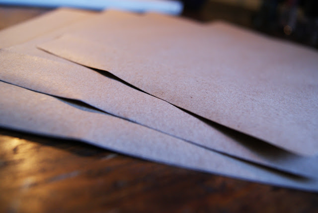
The design style used for this pack is inspired by old typefaces and vintage signage; something I admire and refer to in my personal work. I felt it was important that these letters and stickers convey my own taste and give a reflection of me as a designer. To finish, the letters were placed in a brown envelope to emulate a grocery bag and continue with the lemon theme, before finally being sealed with a sticker.

I hope to receive some positive and constructive feedback from my chosen agencies, I will to keep the blog updated with any news. Fingers crossed!


Monday, July 23

Self Promotion: Society 6

If you read this blog you will know a few things about me; firstly, that I have just graduated with a degree in graphic design and secondly, I am looking for a job within this industry. In pursuit of a job I have made a conscious effort to promote myself to a wider audience through my website, this blog and my twitter account, hoping that the right audience will find me.

Today I added to my self promotional channels by setting up a Society 6 account under the name "Alice E Vaughan", the same as my twitter account. If you don't know, Society 6 is a web based company where designers and artists post their work on the site and Society 6 makes it into prints/iphone cases/canvases ect. All you have to do is set your profit per item and advertise all your designs. Members of the site can also "promote" your work, similar to the "like" button function on Facebook.

Being a relative newbie to the whole process I have only uploaded two prints, which have both featured on this blog before, as a trial run. The whole concept of my own Society 6 account is an experiment in promotion and pricing my own work. I am hoping to add more prints and designs after becoming more knowledgeable about the process, so keep posted.

If you would like to see my work or buy a print you can now do so here!


Saturday, July 21

Self Promotional Illustration

For a while I have been debating on wether to change my blog from dynamic view (how it is at present) to simple view which would allow me much more freedom over the layout. I really like the dynamic view as it prioritises images to make the home page visually exciting, and, of course, it's very user friendly. But, there is a lot of restriction in terms of personalising the page.

I decided to create an illustrative piece that will act as a header for the blog for two reasons. Firstly because the illustration could work as my new header bar for my blog when viewed in mobile and secondly, I really enjoy creating this style of illustration so it's no hardship to spend time doing so.

While I am preparing my blog, website and CV for job applications I am really keen to put my own personal stamp on every aspect of my web presence; and this header could be enough of a feature to achieve this and made me stand out from the crowd.

These are some images of the print out and then on my blog viewed through my mobile.


Monday, July 2

Found Designs #2

Following on from my initial post on the subject of found designs, I have chosen a few of my favourite of my latest iPhone photos taken while out and about. As I said before, I am constantly taking photos of things that inspire me and can be used later, from book covers to packaging and more.

For me, it is important to be aware of design in everyday life; looking at new design styles that can be learnt and applied to new projects later on. This is important to keep my working looking fresh and not risk repetition in my portfolio.


Tuesday, June 19

Hereford College of Arts Degree Show

The start of summer always signals the start of the degree show season; a chance for final year students to showcase their best work in an exhibition to the public and industry experts. If you follow me on twitter then you will of probably heard me banging on about my own show that opens this thursday. However, today I was focusing on another degree show at Hereford College of Arts.

I visited Hereford degree show last year and was really impressed with the work on display, so I was eager to return again this year. Luckily I wasn't disappointed and the standard of work was really high, these are a pick of some of my favourites.


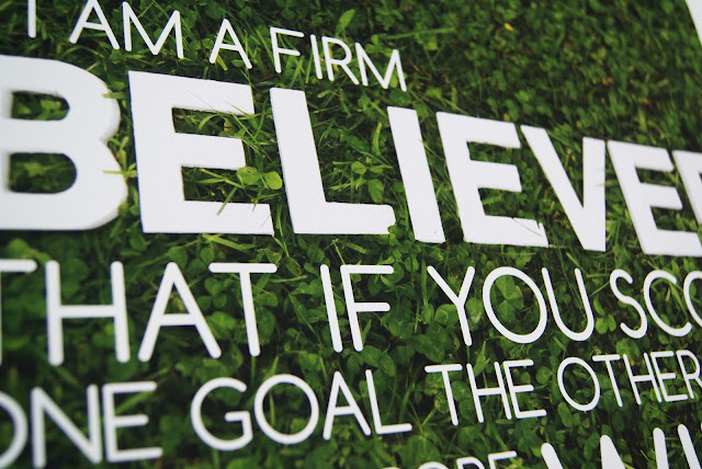
One of the pieces that I particularly liked were these football inspired typographic poster that appeared to be embedded in grass. I love the fresh simplicity of the concept that steers it away from cliche. 


I had come to the degree show for the graphic design but was particularly impressed by the illustration show. I thought it was really interesting to look through the sketchbooks to indicate how the ideas had formed and the experimentation that had taken place. 


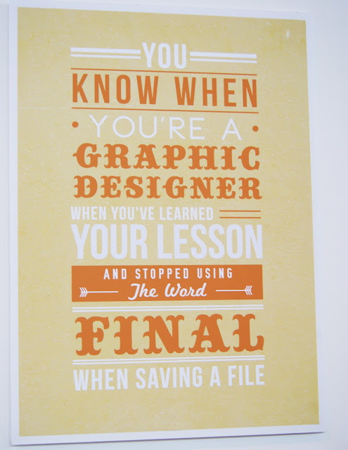
I loved this typographic poster as anyone who has been working on a design project will know these statements are so true! 


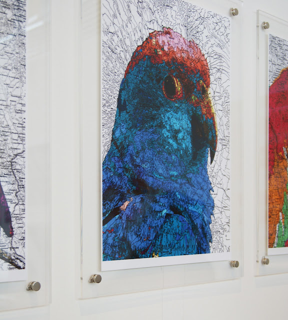
The image on the of the parrot has been printed over a map which creates a lovely texture.


This ad campaign for what I presume is a clothing company was interesting and capitalised on the instagram style trend that is widely popular at the moment. Clean typography gave this poster a youthful yet clean style.


A few people at the show chose to tackle the D&AD typographic brief for Ministry of Sound. Despite the repetition, all those that entered into the brief produced varying styles that approached the task in a range of exciting ways.


Overall the show was varied and dynamic considering the small number of students. I was really impressed with the illustration element of the show which had humour and impact in equal measure. I would advise anyone that has the chance to get down there and visit.

The show is running until June 23rd at Hereford College of Arts

Wednesday, May 30

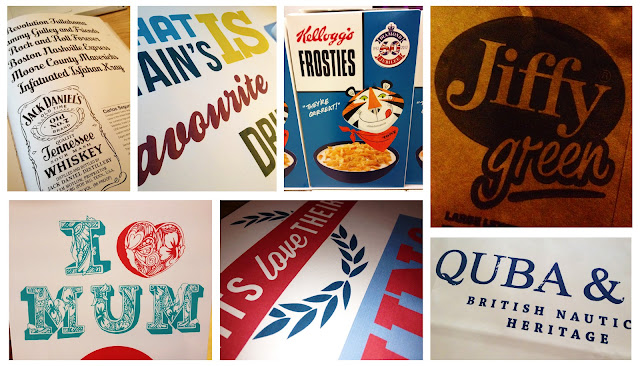
Found Designs

Since I got my iPhone earlier this year I have been taking photos all the time. I never normally carry a camera with me or even profess to be good at photography, but being able to take a photo of a great piece of typography or illustration can be a great reference for future design projects.

I find things that I like everywhere; on parcels, in Tesco, the Frosties box even inspired some design work for this project. This is a few of the examples I found while out.


Wednesday, May 23

Brit Project

In my experience as a graphic designer I have learnt that there will always be one project that you dislike, no matter how much you do to it will always be "the one you don't like". This project is that one I don't like.

The project itself is about making and breaking stereotypes of Brits and looking at the achievements of British people in the field of sport, music and engineering. At the start of the project I had a vague idea of what I wanted but I knew it was going to be typographic based as that was a part of my portfolio that wasn't developed.

As I got into the research and development everything was going great until it came to designing; nothing worked. For ages nothing was working. Until eventually I pulled it together into something just in time for the hand in. Although I don't like the project, it was a useful exercise it experimentation, research and refinement (which I did loads of). Hopefully this project will act as a lesson to myself to stop and come back to something instead of just trying everything to get it to work without thinking about what it means.


Tuesday, May 22

Haven Brochure

I have been really bad at updating my blog lately because of the run up to final third year deadlines. Later on today I will be handing in my double credit module for which I did two briefs; British brief, which I will blog about later, and The Haven brief which I have mentioned before here.

This is one of the artefacts I produced for this project; an information brochure. The Haven is a small breast cancer charity that offers a complementary service of treatments. The real issues they were having were not being able to contact the relevant target audience, which was not helped by poorly designed information packs. As part of this brief I redesigned an element of their information pack and created some illustrations.

Wednesday, May 2

Haven Illustrations Developed

A few weeks ago I mentioned the development of some illustration work needed for my charity project, found here. I felt like the illustrations needed some editing to give the project more "personality" as the images seemed flat and lifeless.

After purchasing my new toy; a bamboo graphics pad last week, I have been working on the project to give the illustrations more life. The pad was fairly easy to get used to in terms of vector based drawing, and after some practise the sketches were slowly improving.

It is essential that the illustrations added to the project as opposed to being purely aesthetic, allowing the reader to understand the content. Each object represents an area of the brochure; from diet and exercise to support, all with an accompanying illustration. To give the project a tactile nature I scanned in various items of clothes to insert into the initial sketches; I used anything with an interesting texture, found, stolen or borrowed. These are a few of the designs in progress.


Thursday, April 5

Haven Illustrations

In one of the modules we are studying this year we could create our own brief; I wanted to do something that was slightly different to any of the work I had done before so chose to work on a charity project. The Haven is a breast cancer charity that does great work but struggles to promote themselves; they have a very strict budget, like many charities, which means that their information packs and posters aren't as effective as they could be. 

After interviewing, researching and and planning I decided to make an information leaflet that could be handed out at treatment centres to target the most appropriate audience demographic. The current promotional material used by the charity did not reflect the subject nor inform the reader about what The Haven could provide, such as complementary treatments. Also the style of the information pack currently used is targeted at an older audience, which is not an accurate representation of all sufferers. 

The brochure itself is the in the process of redesign such as making the content more informative and structured. To accompany the brochure I have produced a series of illustrations, using shape, texture and colour. I hope that these designs will help the reader understand the serious information within the brochure and also be more suitable for all ages. 

I'm not a talented illustrator so stuck to a simple style with the geometric shape being the detail and colour to the piece. The designs will illustrate various areas of the brochure such as "health" and "support". They are defiantly a work in progress but will hopefully look better in context. This is a fictional project and in no way reflects the views of The Haven charity. 

Friday, March 30

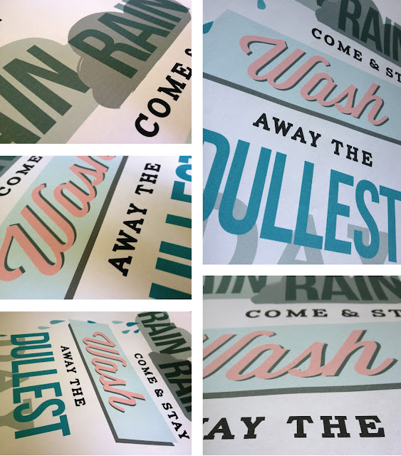
D&AD Rain Poster

About a month ago, Erik Kessels of KesselsKramer invited students from northern universities to design a poster promoting rain. This forms part of his northern lecture on April 5th in Manchester for the D&AD. The brief was to make rain "attractive" without being sarcastic; the brief seemed pretty appropriate to me as whenever I am in Manchester it always seems to rain.

Any award by D&AD has such a sense of prestige, so I definitely wanted to enter something. I intended to use typography as the poster would be forming research for another project I am working on also based on type. When devising concepts for the project I was influenced by the work of Saul Bass as he is well known for his combination of type and imagery to great effect.

I decided to base my poster on the children's nursery rhyme "Rain, rain, go away" but making the rain into a positive feature. The poster is intended to be emotive in the way that the clouds behind "rain" look although they are just about to pour down and "wash" looks like a 50's launderette sign. The Saul Bass elements of shape and typography have been added to create further impact to the statement.

After Easter break I want to get the poster screen printed after some adjustments, I don't feel like it is totally finished and needs a lot of work yet, but hopefully will translate well on print. These are a few images as it stands.


Tuesday, March 6

"Untitled" Degree Show Ident

For our final degree show in June the design committee, who are responsible for naming, funding and organising the show, have chosen to call it "Untitled". When I first heard this on monday I was pretty disappointed with the lack of imagination and thought that had gone into this choice. Students in third year, like myself, were invited to create an ident for the degree show, with the most popular design becoming the branding. With Chester being quite a small university it is vital our degree show branding attracts some attention and lets the public know about the great design being produced.

Despite the relatively generic name of "Untitled" it did allow a lot of freedom when designing an identity for the degree show. It was a great opportunity to create something, exciting, crazy and fun for our show that would make us stand out. With this in mind I chose to make something quirky and vibrant that illustrated "Untitled".

Monday, February 27

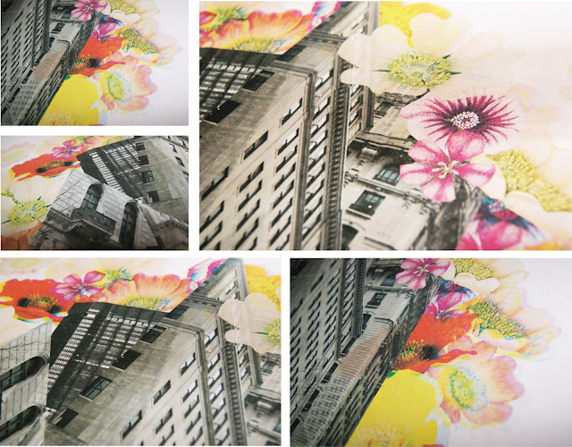
Ruban In Progress

As I had said in some of my previous posts, I have been working on a project called Ruban; this involves creating a digital collage, contrasting urban with rural imagery. Each week my friend and I exchange designs with a 250 word rationale then spend the following week responding to their collage. This week I have been working on my response with the theme of contrasting the geometric styles of architecture with natural images. These are some images of the work in progress.