Any award by D&AD has such a sense of prestige, so I definitely wanted to enter something. I intended to use typography as the poster would be forming research for another project I am working on also based on type. When devising concepts for the project I was influenced by the work of Saul Bass as he is well known for his combination of type and imagery to great effect.
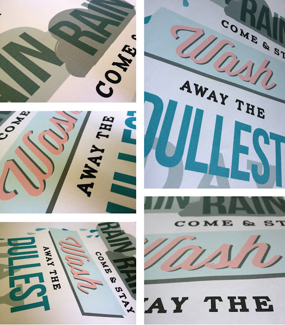
I decided to base my poster on the children's nursery rhyme "Rain, rain, go away" but making the rain into a positive feature. The poster is intended to be emotive in the way that the clouds behind "rain" look although they are just about to pour down and "wash" looks like a 50's launderette sign. The Saul Bass elements of shape and typography have been added to create further impact to the statement.
After Easter break I want to get the poster screen printed after some adjustments, I don't feel like it is totally finished and needs a lot of work yet, but hopefully will translate well on print. These are a few images as it stands.

