photo imfresh2_zpsd65868bc.jpg  photo untitledcollection_zps84a740fd.jpg  photo phunk_zpsb7e679f8.jpg  photo havenbrochurecollectivecopy_zpsbcef5f41.png  photo rubanimages_zps7ead41bd.jpg  photo exhibinpractise_zps178c39b5.png  photo finishedruban_zpsd1229a75.jpg  photo tips_zps509f1619.jpg  photo degreeshowopening_zps0f4801ea.jpg  photo lemonstickers2_zps6d8fb7e9.jpg  photo interviewtips_zps56764e69.jpg  photo placement_zpsb679140e.jpg  photo graduation_zps13fcb4f1.jpg
Showing posts with label Experimentation. Show all posts

Monday, September 10

Updates: Books & Website

This post is a general round up of a few things I have been working on, looking at and trying to do. My current main aim is trying to find a job within the design industry, balanced between some freelance projects and my less exciting day job. I am trying to make a conscious effort to keep integrated with design and new projects so this is a short round up of some thoughts and designs.

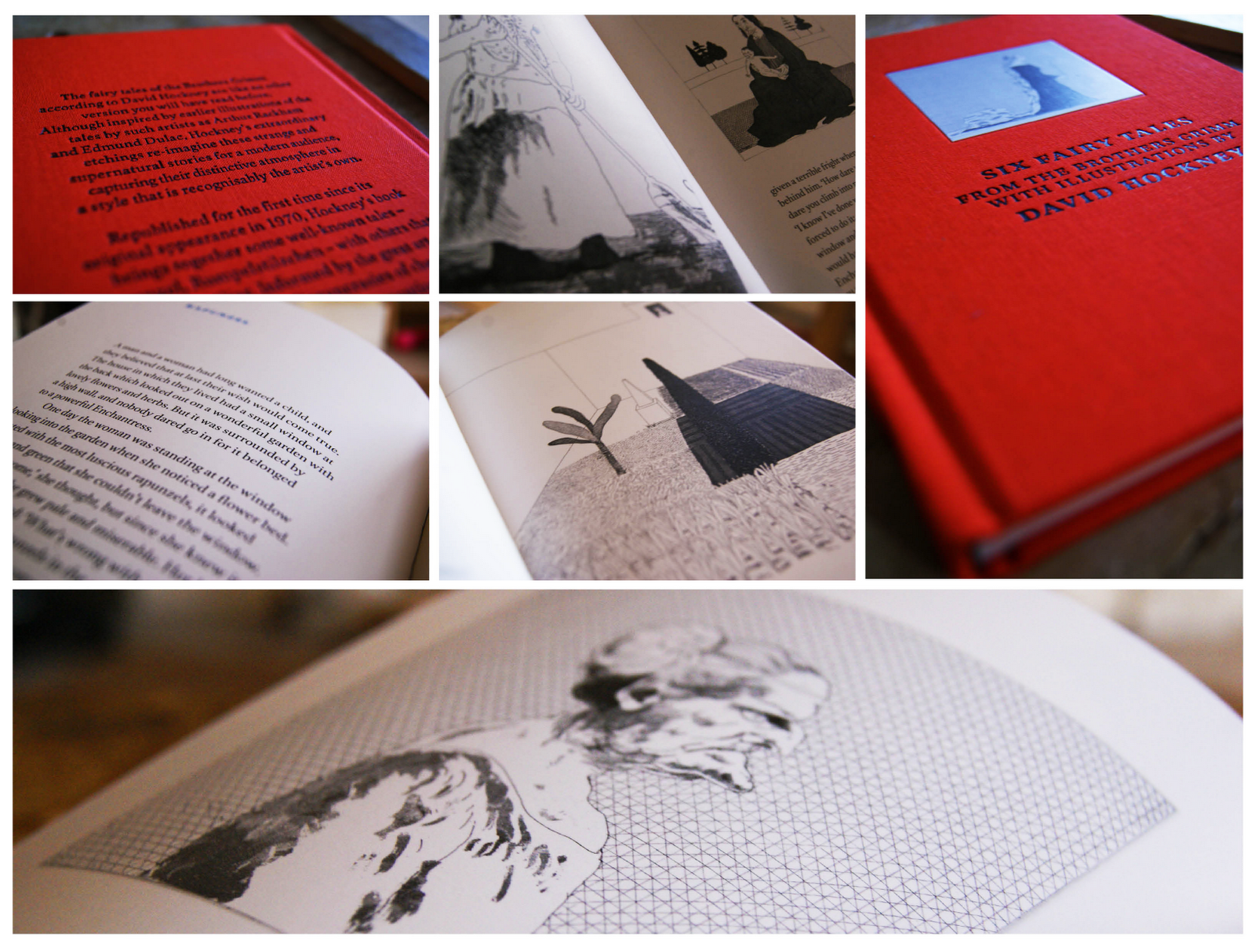
First up is a book that I was recently given by my friend Abbie, a friend and fellow designer. The book itself is a collection of six fairytales by The Brothers Grimm with illustrations from David Hockney, if you don't know who David Hockney is then you should definitely check out his work here (he's kind of a big deal).

The stories are very traditional and stick with the Brother Grimm heritage as some are quite gruesome. The main focus for me are the illustrations which are intricate and finely detailed; perfectly suited to the imaginative and magical stories. See some photos below.


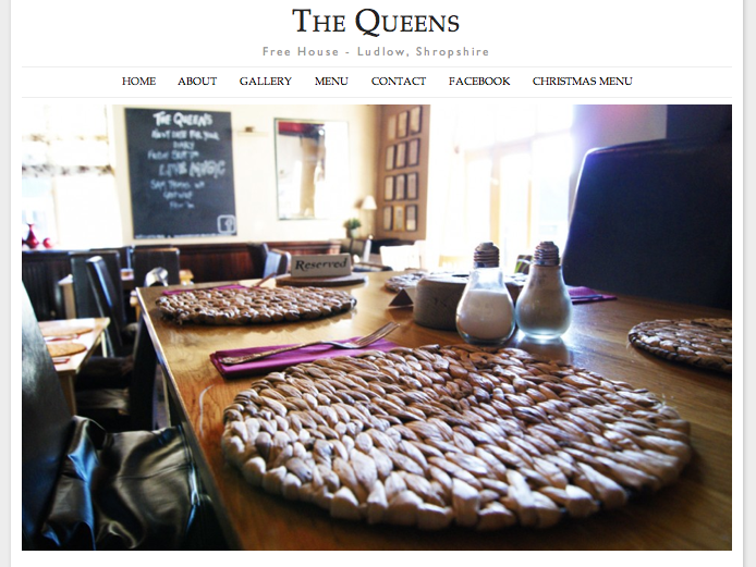
Secondly I have been working on a new website; when I'm not trying to be a graphic designer I am working at my parents pub as a waitress and barmaid. Recently I was able to merge the two and create a new website for the pub using some of my basic, but improving web design skills.

The pub is called The Queens and you can visit the site at www.thequeensludlow.com. The site is mainly finished but subject to some tweaking so be aware that changes are being made to improve the site constantly.

I was aiming for a clean look punctuated with images which I think has been achieved. My next step is to make the gallery more user interactive as currently the images can't be selected.


Thirdly, I have been searching for jobs and following up contact I made with companies regarding my lemon letters and lemon post. Last tuesday I went to visit one of the companies who kindly invited me for a portfolio review which was great to feel like I have made some kind of impression and getting positive feedback. Finding a job, especially your first job after graduation can be tricky but I'm hoping persistence will pay off and I will get somewhere in the near future.

Thursday, September 6

Ipad Designer Apps #1

For my birthday last week I was fortunate enough to receive an iPad. Of course, like most people I thought they were cool, but how could the be more than just a toy? Although great for films, internet browsing and games, how could I use the iPad to help me as a designer?

I investigated into a few apps and these are some that I think are useful tool to make the iPad work as a tool for designers'.


Evernote

First up is Evernote; essentially a mood board app where by images, internet clippings, recordings and notes can be kept together. Before I downloaded this app I thought it sounded great; as a designer, collecting inspirations and notes can prove invaluable and as the app is free, it was definitely on my download list. 

When I started to use the app I found it was very easy to use and explained the features well. The interface is relatively simple so anybody with basic computer knowledge should be able to master Evernote in a matter of minutes. 

Pros: Very easy to use, useful app, free and can sync between devices
Cons: Only tiny, but I did find a broken link on the "getting started" page.

Download Evernote here for free


PS Express

The Adobe creative suite is the industry standard when it comes to graphic design so I knew whatever app the brought out would be worth downloading. Unfortunately, Adobe don't yet have their creative suite iPad ready but this basic alternative does the trick when it comes to simple image editing. 

Users select a photo and can then choose from a range of effects, borders and filters to edit the image. But don't panic! It's not all inverted colours and posterize; you can really achieve some photos if you take the time to play around. I predominately use this programme for simple image editing if I'm using my iPad to blog with. 

The only downside to this product are the added cost of some features which you initially presume to be free. Of course, you can just have the app with no added "bundles" but the editing capacity is extremely limited.

Pros: similar interface to other Adobe products, good quality edited images can be achieved.
Cons: Sneaky added "bundles" mean the app is not entirely free. You don't have to add them but you do have more options if you do add them on.

I have tried a few image editing apps for iPad and this is by far the best.

Get PS Express here for free


Penultimate (from the makers of Evernote)

A very simple note pad add with a range of different papers, pen colours and pen widths. This app is not a miracle app but it is extremely useful, and the range of squared, lined or plain paper makes it useful for a number of tasks.

You can go onto the "paper shop" and add various other types of papers including music sheets, "Young Writers" paper with extra spaced lines, "games" paper and photo pages. Every added package is 69p but does make the app of much more multi functional.

You can sync Penultimate with Dropbox and Evernote and adjust the many settings to customise the programme to the user.

Pros: Easy to use, range of papers, add more "notebooks" to keep order of your notes, you can also add a photo into the page which can be great for annotations.
Cons: Not many pen colours or widths.

Overall a great little app.

Get the app here for a very reasonable 69p


Pinterest

Finally, it's the Pinterest app; I think Pinterest must of been made for iPads because they are perfect partners. Pinterest is designed for internet browsing and inspiration which is made all the better when you can have an iPad on your lap and a tea in your hand as you flick through your "pins" and "likes" with ease. For a designer, having a collection of inspiring images you can so easily view is definitely an app worth having. 

Pros: I find Pinterest on the iPad a lot easier than iPhone due to the larger screen and being able to use the touch screen makes it a lot easier than a mac. 
Cons: None. It's free and a useful networking tool so what is there not to like?

Get Pinterest here for free



Monday, July 23

Self Promotion: Society 6

If you read this blog you will know a few things about me; firstly, that I have just graduated with a degree in graphic design and secondly, I am looking for a job within this industry. In pursuit of a job I have made a conscious effort to promote myself to a wider audience through my website, this blog and my twitter account, hoping that the right audience will find me.

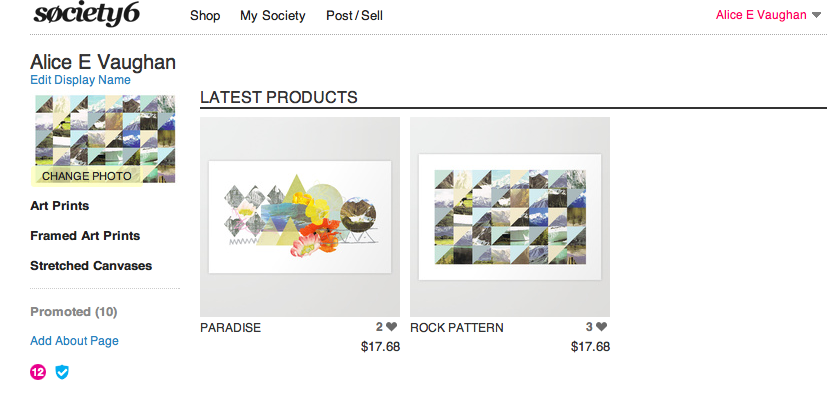
Today I added to my self promotional channels by setting up a Society 6 account under the name "Alice E Vaughan", the same as my twitter account. If you don't know, Society 6 is a web based company where designers and artists post their work on the site and Society 6 makes it into prints/iphone cases/canvases ect. All you have to do is set your profit per item and advertise all your designs. Members of the site can also "promote" your work, similar to the "like" button function on Facebook.

Being a relative newbie to the whole process I have only uploaded two prints, which have both featured on this blog before, as a trial run. The whole concept of my own Society 6 account is an experiment in promotion and pricing my own work. I am hoping to add more prints and designs after becoming more knowledgeable about the process, so keep posted.

If you would like to see my work or buy a print you can now do so here!


Saturday, July 21

Self Promotional Illustration

For a while I have been debating on wether to change my blog from dynamic view (how it is at present) to simple view which would allow me much more freedom over the layout. I really like the dynamic view as it prioritises images to make the home page visually exciting, and, of course, it's very user friendly. But, there is a lot of restriction in terms of personalising the page.

I decided to create an illustrative piece that will act as a header for the blog for two reasons. Firstly because the illustration could work as my new header bar for my blog when viewed in mobile and secondly, I really enjoy creating this style of illustration so it's no hardship to spend time doing so.

While I am preparing my blog, website and CV for job applications I am really keen to put my own personal stamp on every aspect of my web presence; and this header could be enough of a feature to achieve this and made me stand out from the crowd.

These are some images of the print out and then on my blog viewed through my mobile.


Wednesday, May 23

Brit Project

In my experience as a graphic designer I have learnt that there will always be one project that you dislike, no matter how much you do to it will always be "the one you don't like". This project is that one I don't like.

The project itself is about making and breaking stereotypes of Brits and looking at the achievements of British people in the field of sport, music and engineering. At the start of the project I had a vague idea of what I wanted but I knew it was going to be typographic based as that was a part of my portfolio that wasn't developed.

As I got into the research and development everything was going great until it came to designing; nothing worked. For ages nothing was working. Until eventually I pulled it together into something just in time for the hand in. Although I don't like the project, it was a useful exercise it experimentation, research and refinement (which I did loads of). Hopefully this project will act as a lesson to myself to stop and come back to something instead of just trying everything to get it to work without thinking about what it means.


Wednesday, May 2

Haven Illustrations Developed

A few weeks ago I mentioned the development of some illustration work needed for my charity project, found here. I felt like the illustrations needed some editing to give the project more "personality" as the images seemed flat and lifeless.

After purchasing my new toy; a bamboo graphics pad last week, I have been working on the project to give the illustrations more life. The pad was fairly easy to get used to in terms of vector based drawing, and after some practise the sketches were slowly improving.

It is essential that the illustrations added to the project as opposed to being purely aesthetic, allowing the reader to understand the content. Each object represents an area of the brochure; from diet and exercise to support, all with an accompanying illustration. To give the project a tactile nature I scanned in various items of clothes to insert into the initial sketches; I used anything with an interesting texture, found, stolen or borrowed. These are a few of the designs in progress.


Tuesday, May 1

Letterpress

Letterpress is an old technique that requires a lot of time to produce a successful print. I have attempted letterpress a number of times, a few weeks ago I went along to another workshop as experiment for another project. The effect achieved by manual letterpress far surpasses any digital replication, so it's a great addition to a final piece to reflect the time and consideration taken over a project.

Letterpress does require a lot of patience (which I don't have) but the effect produced is worth the time taken. The experimentation shown here is the initial practise which will hopefully develop into a cleaner designs.


Friday, March 30

D&AD Rain Poster

About a month ago, Erik Kessels of KesselsKramer invited students from northern universities to design a poster promoting rain. This forms part of his northern lecture on April 5th in Manchester for the D&AD. The brief was to make rain "attractive" without being sarcastic; the brief seemed pretty appropriate to me as whenever I am in Manchester it always seems to rain.

Any award by D&AD has such a sense of prestige, so I definitely wanted to enter something. I intended to use typography as the poster would be forming research for another project I am working on also based on type. When devising concepts for the project I was influenced by the work of Saul Bass as he is well known for his combination of type and imagery to great effect.

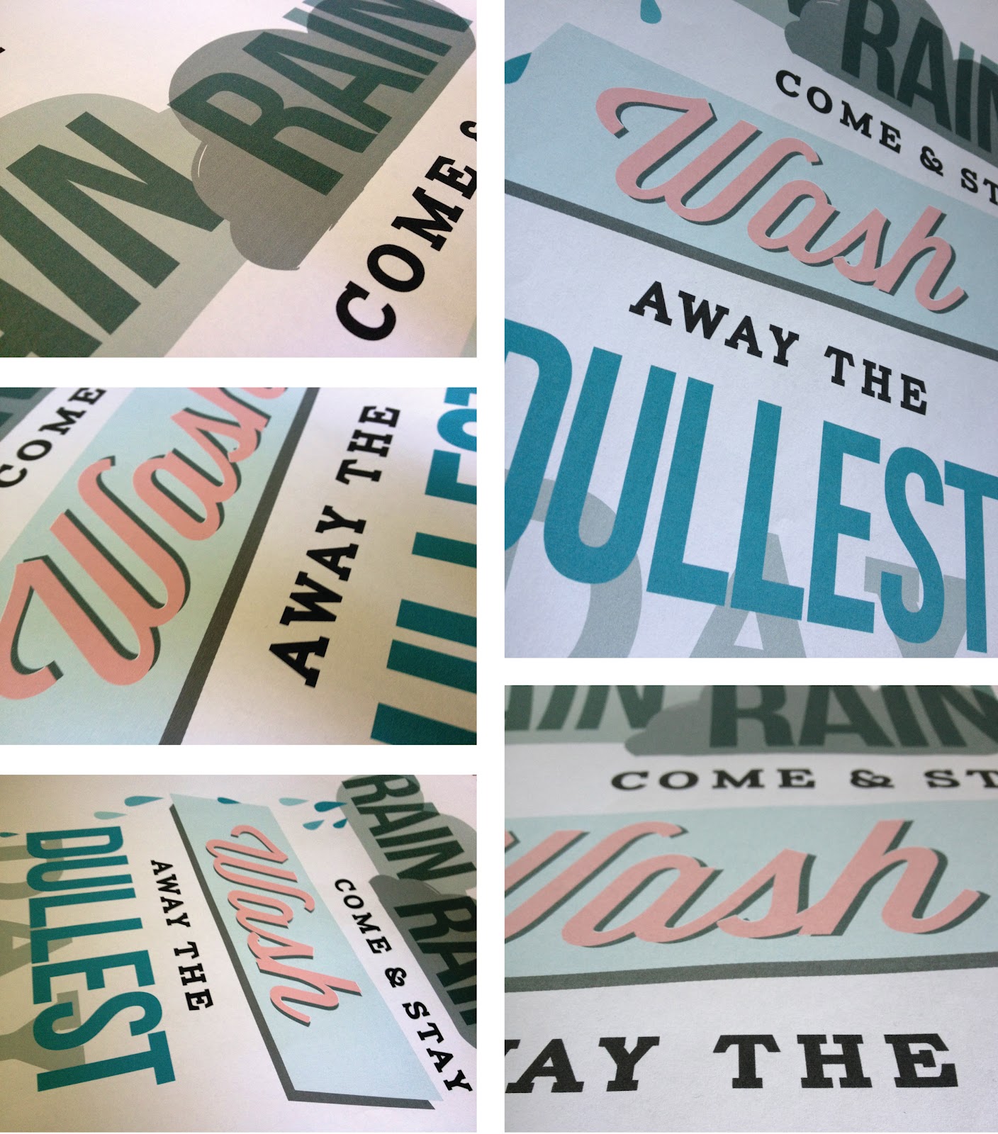
I decided to base my poster on the children's nursery rhyme "Rain, rain, go away" but making the rain into a positive feature. The poster is intended to be emotive in the way that the clouds behind "rain" look although they are just about to pour down and "wash" looks like a 50's launderette sign. The Saul Bass elements of shape and typography have been added to create further impact to the statement.

After Easter break I want to get the poster screen printed after some adjustments, I don't feel like it is totally finished and needs a lot of work yet, but hopefully will translate well on print. These are a few images as it stands.


Wednesday, March 21

Screenprinting Experimentation

Recently I have been working on two really interesting, fun briefs; one about culture and another D&AD project about the benefits of rain. As the designs for both of these projects have progressed, I have been thinking more and more about screen printing; an old fashioned, manual technique that leaves a beautiful raw finish to prints. It would be the perfect style for both designs and something I have always wanted to experiment with, so, as research I went and had a go today.

I didn't know a lot about the process until today, only that paint is pulled through a fine material mesh to leave areas of paint which becomes the print. The actual method of preparing the screens take at least a day as you have to separate the colours in your print work, let the material be exposed to light and chemicals to create the blocked out sections, and then the paint has to be made up to your specific colours with more chemicals. It takes ages! But, it is so worth if for the great effect you are left with and the depth that can be achieved through layering colours. In this example above the screens have been set with an image of a tweed coat to practise with which looked great when the colours started to create a thick weave effect.

After Easter I am going to make up screens with my own design on and hopefully get some printed, if successful they will go towards my final degree show in June. It was great to have the chance to work with some of these old techniques like screen printing and letterpress because I think it adds a quality you just can't get with digital printing.