photo imfresh2_zpsd65868bc.jpg  photo untitledcollection_zps84a740fd.jpg  photo phunk_zpsb7e679f8.jpg  photo havenbrochurecollectivecopy_zpsbcef5f41.png  photo rubanimages_zps7ead41bd.jpg  photo exhibinpractise_zps178c39b5.png  photo finishedruban_zpsd1229a75.jpg  photo tips_zps509f1619.jpg  photo degreeshowopening_zps0f4801ea.jpg  photo lemonstickers2_zps6d8fb7e9.jpg  photo interviewtips_zps56764e69.jpg  photo placement_zpsb679140e.jpg  photo graduation_zps13fcb4f1.jpg
Showing posts with label Design In Progress. Show all posts

Monday, September 10

Updates: Books & Website

This post is a general round up of a few things I have been working on, looking at and trying to do. My current main aim is trying to find a job within the design industry, balanced between some freelance projects and my less exciting day job. I am trying to make a conscious effort to keep integrated with design and new projects so this is a short round up of some thoughts and designs.

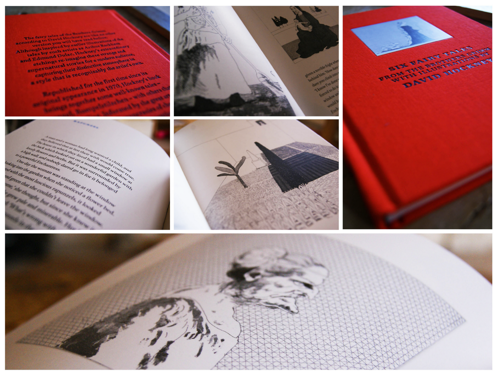
First up is a book that I was recently given by my friend Abbie, a friend and fellow designer. The book itself is a collection of six fairytales by The Brothers Grimm with illustrations from David Hockney, if you don't know who David Hockney is then you should definitely check out his work here (he's kind of a big deal).

The stories are very traditional and stick with the Brother Grimm heritage as some are quite gruesome. The main focus for me are the illustrations which are intricate and finely detailed; perfectly suited to the imaginative and magical stories. See some photos below.

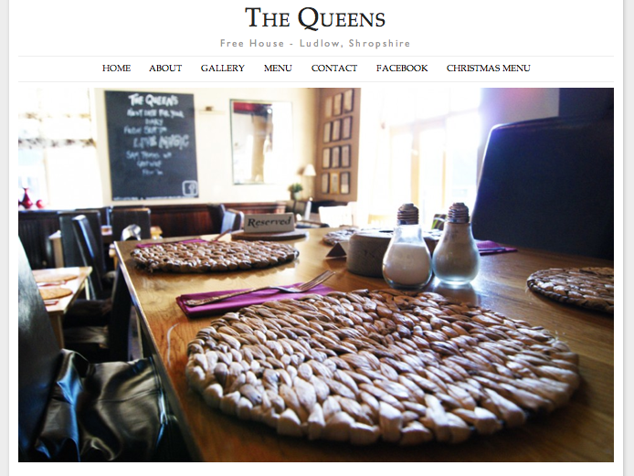
Secondly I have been working on a new website; when I'm not trying to be a graphic designer I am working at my parents pub as a waitress and barmaid. Recently I was able to merge the two and create a new website for the pub using some of my basic, but improving web design skills.

The pub is called The Queens and you can visit the site at www.thequeensludlow.com. The site is mainly finished but subject to some tweaking so be aware that changes are being made to improve the site constantly.

I was aiming for a clean look punctuated with images which I think has been achieved. My next step is to make the gallery more user interactive as currently the images can't be selected.

Thirdly, I have been searching for jobs and following up contact I made with companies regarding my lemon letters and lemon post. Last tuesday I went to visit one of the companies who kindly invited me for a portfolio review which was great to feel like I have made some kind of impression and getting positive feedback. Finding a job, especially your first job after graduation can be tricky but I'm hoping persistence will pay off and I will get somewhere in the near future.

Friday, August 31

I'm Fresh #2

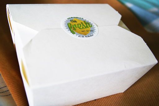
Recently I began my job search by sending out a letter and stickers based on a lemon concept to various companies (see it here). I wanted to create a campaign to send to these design agencies so that I would stand out from what I expect would be thousands of other potential candidates. 

The campaign was based around lemons with "I'm fresh out of university" being the main tag line on the stickers along with lemon illustrations and some lemon based puns. Luckily, I did get some response to my letters but to ensure these companies didn't forget me I began part two of the "I'm Fresh" campaign and sent out another package. 

The new package had to be bold, interesting and attention grabbing. To achieve these criteria I wrote another letter, included a CV, more stickers and a lemon then neatly packed it into a box and sent it off yesterday evening by special delivery. Hopefully they will arrive on somebody's desk sometime today. 

I spent a lot of time and effort getting this package to look right and i'm hoping this is reflected. 


Saturday, July 21

Self Promotional Illustration

For a while I have been debating on wether to change my blog from dynamic view (how it is at present) to simple view which would allow me much more freedom over the layout. I really like the dynamic view as it prioritises images to make the home page visually exciting, and, of course, it's very user friendly. But, there is a lot of restriction in terms of personalising the page.

I decided to create an illustrative piece that will act as a header for the blog for two reasons. Firstly because the illustration could work as my new header bar for my blog when viewed in mobile and secondly, I really enjoy creating this style of illustration so it's no hardship to spend time doing so.

While I am preparing my blog, website and CV for job applications I am really keen to put my own personal stamp on every aspect of my web presence; and this header could be enough of a feature to achieve this and made me stand out from the crowd.

These are some images of the print out and then on my blog viewed through my mobile.


Wednesday, July 18

Prima Oliva Branding

A friend recently approached me about helping him rebrand his company; Prima Oliva. The company makes and sells specialist olive oils to wholesalers, restaurants and pubs. The brief was quite open so there were plenty of avenues to research and explore first. After some research and developing a logo I came up with this.

The new design takes reference from traditional olive oil bottles and street sinage, combined with a clean style to give a modern and sophisticated approach. The colour palette was key to make the new branding relevant to the company as the light greens and yellows can be associated with the olives, olive trees and the oil. 

This is a super quick mockup of some potential letter heads, business cards and compliments slips that will create a clean and consistent brand for the company.


Wednesday, May 2

Haven Illustrations Developed

A few weeks ago I mentioned the development of some illustration work needed for my charity project, found here. I felt like the illustrations needed some editing to give the project more "personality" as the images seemed flat and lifeless.

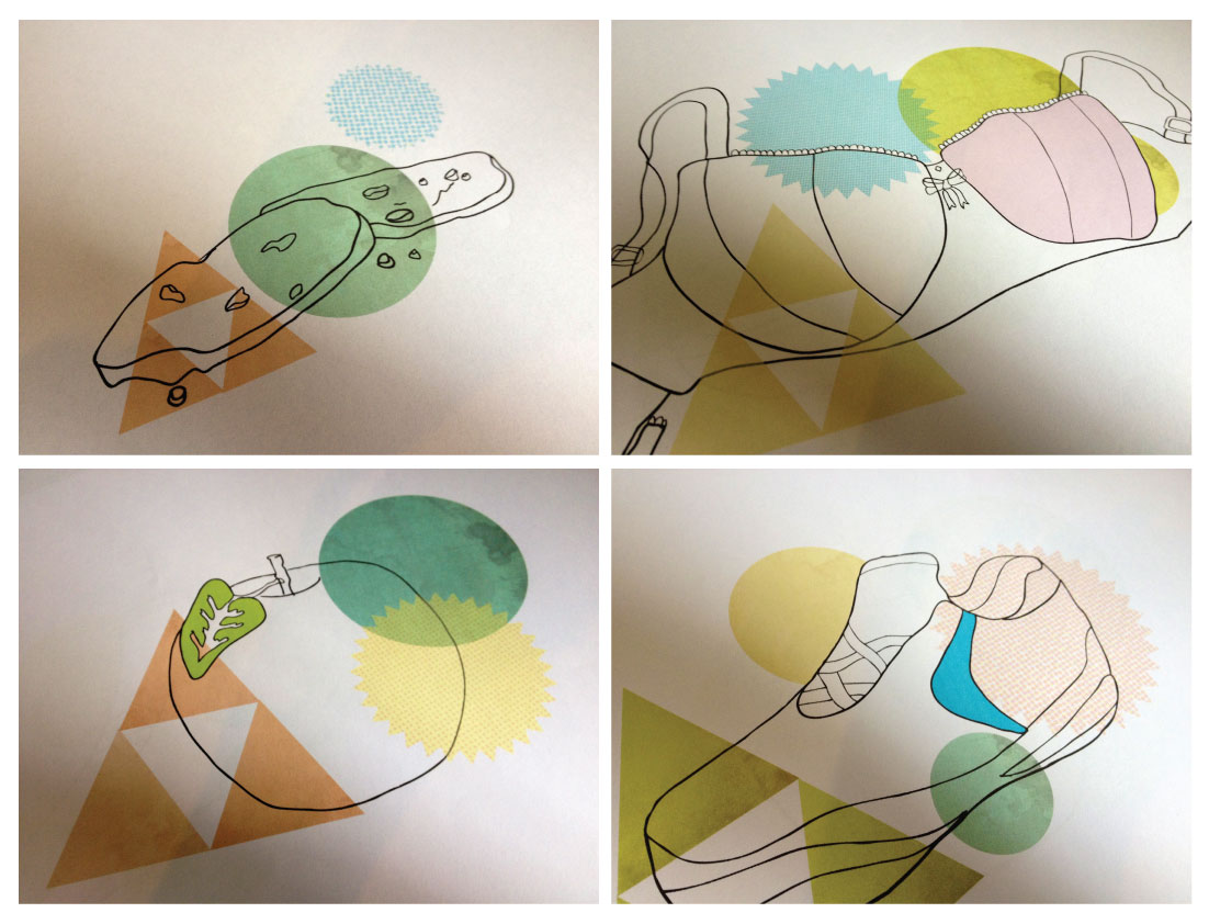
After purchasing my new toy; a bamboo graphics pad last week, I have been working on the project to give the illustrations more life. The pad was fairly easy to get used to in terms of vector based drawing, and after some practise the sketches were slowly improving.

It is essential that the illustrations added to the project as opposed to being purely aesthetic, allowing the reader to understand the content. Each object represents an area of the brochure; from diet and exercise to support, all with an accompanying illustration. To give the project a tactile nature I scanned in various items of clothes to insert into the initial sketches; I used anything with an interesting texture, found, stolen or borrowed. These are a few of the designs in progress.


Thursday, April 5

Haven Illustrations

In one of the modules we are studying this year we could create our own brief; I wanted to do something that was slightly different to any of the work I had done before so chose to work on a charity project. The Haven is a breast cancer charity that does great work but struggles to promote themselves; they have a very strict budget, like many charities, which means that their information packs and posters aren't as effective as they could be. 

After interviewing, researching and and planning I decided to make an information leaflet that could be handed out at treatment centres to target the most appropriate audience demographic. The current promotional material used by the charity did not reflect the subject nor inform the reader about what The Haven could provide, such as complementary treatments. Also the style of the information pack currently used is targeted at an older audience, which is not an accurate representation of all sufferers. 

The brochure itself is the in the process of redesign such as making the content more informative and structured. To accompany the brochure I have produced a series of illustrations, using shape, texture and colour. I hope that these designs will help the reader understand the serious information within the brochure and also be more suitable for all ages. 

I'm not a talented illustrator so stuck to a simple style with the geometric shape being the detail and colour to the piece. The designs will illustrate various areas of the brochure such as "health" and "support". They are defiantly a work in progress but will hopefully look better in context. This is a fictional project and in no way reflects the views of The Haven charity. 

Friday, March 30

D&AD Rain Poster

About a month ago, Erik Kessels of KesselsKramer invited students from northern universities to design a poster promoting rain. This forms part of his northern lecture on April 5th in Manchester for the D&AD. The brief was to make rain "attractive" without being sarcastic; the brief seemed pretty appropriate to me as whenever I am in Manchester it always seems to rain.

Any award by D&AD has such a sense of prestige, so I definitely wanted to enter something. I intended to use typography as the poster would be forming research for another project I am working on also based on type. When devising concepts for the project I was influenced by the work of Saul Bass as he is well known for his combination of type and imagery to great effect.

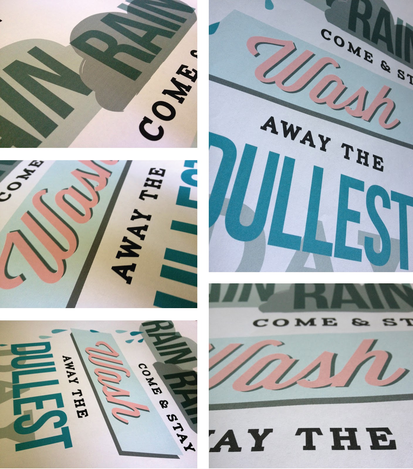
I decided to base my poster on the children's nursery rhyme "Rain, rain, go away" but making the rain into a positive feature. The poster is intended to be emotive in the way that the clouds behind "rain" look although they are just about to pour down and "wash" looks like a 50's launderette sign. The Saul Bass elements of shape and typography have been added to create further impact to the statement.

After Easter break I want to get the poster screen printed after some adjustments, I don't feel like it is totally finished and needs a lot of work yet, but hopefully will translate well on print. These are a few images as it stands.


Sunday, January 29

Exhibition & Miscellaneous

I've been really bad at updating my blog and website at the minute because of all the deadlines going on, so attempting to counteract this by actually posting something. Once the deadline is handed in on the 6th of February and the exhibition is over (Februray 6th - 10th) then I'm going to update both with some new things and give them an image overhaul.

These past two weeks i've been working on some typographic treatments for my exhibition piece which is to rebrand our campus. The exhibition counts for 50% of the module so I really want it to be interactive and allow the user to add to the piece. On friday night I ordered some stickers and postcards to be used within the exhibition and hopefully just make it something people can have fun with. As of yet nothing had been properly printed for the exhibition so I only have some screen shots of the designs or rubbish print out versions. These are some of screenshots of things I have been working on which will hopefully look better screen printed on thick recycled card.


These actual designs are part of a series of seven postcards that will be sent out to design agencies as promotional pieces inviting them to Kingsway Gallery. Ideally I would of loved to get them screen printed to get that great texture and richness screen printing allows but time constraints means I had to just use the four colour printing process.

These are some examples of the stickers that will be used within the exhibition. The concept behind these were to promote a sense of positivity and interaction between the range of courses at Kingsway Campus. When the stickers arrive I am going to have about 100, so will probably end up with them just everywhere.

There are plenty more projects I am in the middle of right now so need to keep updating this blog with things i'm doing; working on branding, working on "live briefs" and trying to get more "live" work also dissertations, packaging, presentations and eating a lot of timeouts.