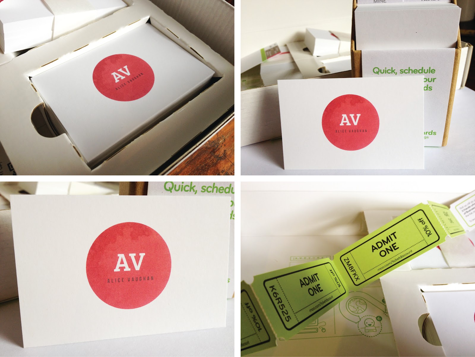


First up is my own work which was an awareness campaign and brochure for a breast cancer charity called The Haven. You may of seen me talking about it here. The campaign will be situated in womens' dressing rooms and play upon the word "change" in terms of changing your clothes and changing and improving your health with The Haven. My exhibition space had a mirror, chair and clothes hook to make it appear like an actual changing room.


Type perfectionist James Matthews came up with a great book to teach student designers the basics of typography through fun exercises.

James Mellor worked on a project to change perceptions of tattoos and promote great tattoo design through the "Orange Tattoo Forum" with real tattooed oranges.


Pattern enthusiast Laura Edwards produced a range lovely of travel themed prints with appropriate props to match.

Alex Franklin masterminded a rebrand of the extreme sport parkour. He produced a range of artefacts to promote the sport as a beneficial activity for kids and teenagers,

A really interesting brief by David Yates; to encourage men to buy flowers for other men by explaining the meaning behind each flower and what it can symbolise.

One of my favourites of the show is by James Bingham. He undertook the YCN brief to create a picnic basket for M&S. The Japanese inspired pack included extensive examples of packaging and advertising and photography.

Adam Tomlin presented a rebrand of our campus with some exciting conceptual sculpture ideas.

Sophie Lou hand drew a series of prints and patterns in a geometric style to create an eye catching piece.

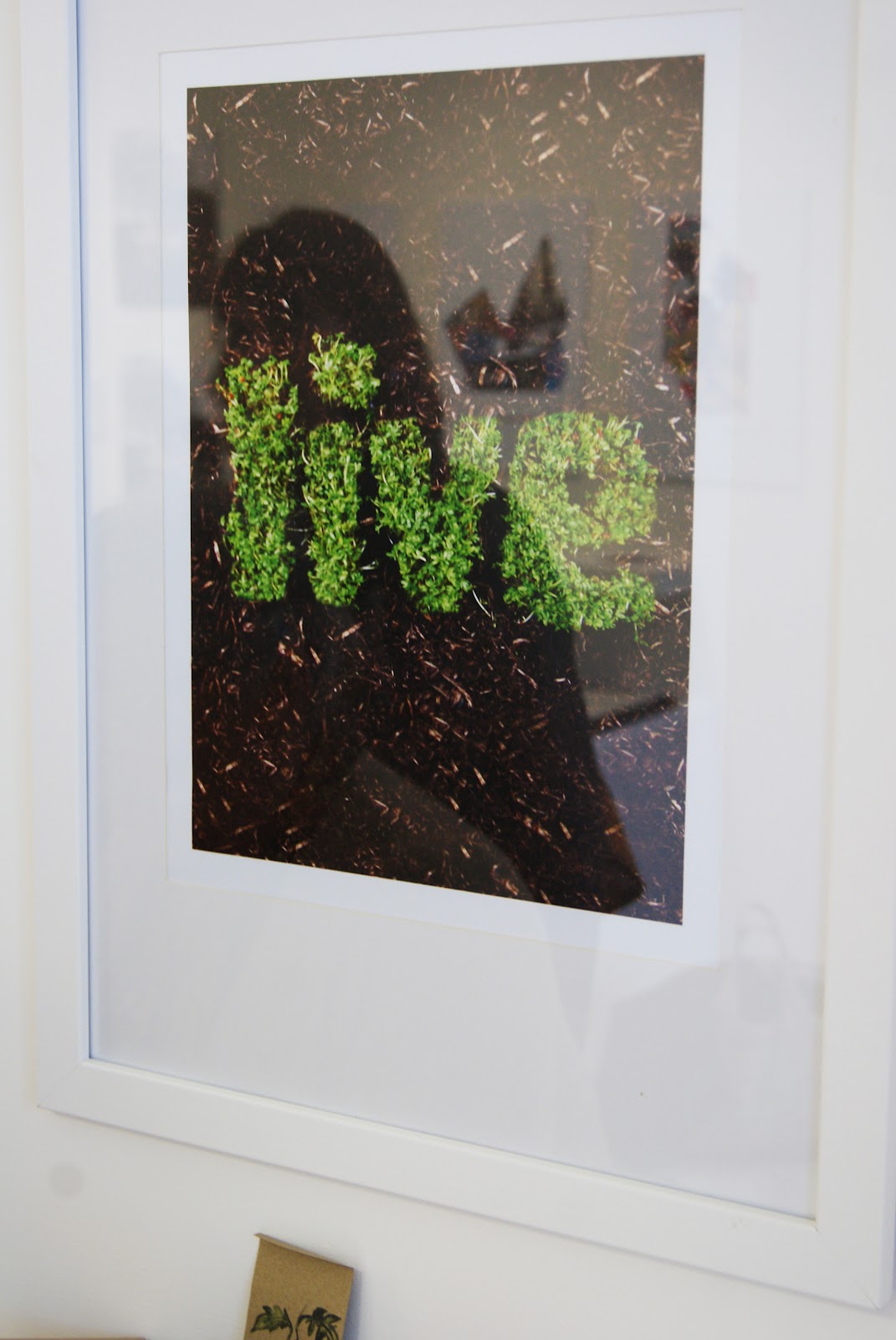
Michael Goldsworthy created a giant map of the UK using plasticine to explore childhood nostalgia. He asked visitors to add to the map by creating a mini model of happy memory in a relevant spot on the map. I love the tactile nature of this piece which had everyone crowded around on the opening night eager to add to it.


Emma Wilson rebranded a sweetshop using real props. These were in real danger of being eaten during degree set up so luckily some have survived to see the show.

Hayley Miles produced a range of typographic posters to promote "The Wizard of Oz" to a younger audience. The whole aesthetic of her exhibition tied in really nicely which made it look professional and slick.

Of course there are lots more exciting pieces to see in Graphic Design, Fine Art and Photography so do make sure you visit or look up some of these designers.
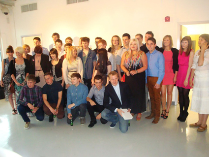
Overall it has been great to see these concepts form to now seeing them presented in the exhibition and the show has dynamic and bold feel to it due to the diversity of the work on show. And that pretty much concludes my three year Graphic design degree, all that is left to do now is wait for the results.