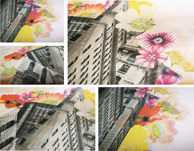
As I had said in some of my previous posts, I have been working on a project called Ruban; this involves creating a digital collage, contrasting urban with rural imagery. Each week my friend and I exchange designs with a 250 word rationale then spend the following week responding to their collage. This week I have been working on my response with the theme of contrasting the geometric styles of architecture with natural images. These are some images of the work in progress.
Monday, February 27
Monday, February 20
Business Plan & Business Offer
One of the modules I am studying this year requires teams to make a business plan, I did do business at college but I was rubbish, despite this I was interested in finding out how to go about creating a professional plan and what would be involved. I was put into a group with Sophie and James and we quickly settled on a concept of live music events and a name; Phunk A Saurus Events.
The idea is that we would hold live music events in Chester, Warrington, Liverpool and Manchester once a week with a larger act and some local unsigned talent. We wanted to promote grass roots talent and give them the platform to perform with larger acts but also give the audience an intimate live experience. The concept was real but we didn't have to go as far as actually holding events, just enquire about prices and venue information.
Each week we had to create a presentation and have roles within the "business", for some reason I was in charge of finances, I am not a maths brain but the calculations were pretty much common sense and it all worked out right. The final assessment of the module was a presentation in front of a board of people in a Dragon's Den style plus create a physical business plan. My group wanted ours to be printed on newspaper in a "zine" style which was complex to work out initially as the GSM of newsprint is so low it can't be used by most printers. Despite the complications we did eventually manage to print our zine business plan and our presentation seemed to go really smoothly.
A few weeks later we were told by our lecturer that one of the board members had been impressed with our business plan and wanted to help us get the idea off the ground, giving us free business advice and helping us get a loan. It was so great that someone actually saw potential in Phunk A Saurus and we defiantly put the hours in so maybe it will be a reality one day.
Phunk A Saurus logo.
The idea is that we would hold live music events in Chester, Warrington, Liverpool and Manchester once a week with a larger act and some local unsigned talent. We wanted to promote grass roots talent and give them the platform to perform with larger acts but also give the audience an intimate live experience. The concept was real but we didn't have to go as far as actually holding events, just enquire about prices and venue information.
Each week we had to create a presentation and have roles within the "business", for some reason I was in charge of finances, I am not a maths brain but the calculations were pretty much common sense and it all worked out right. The final assessment of the module was a presentation in front of a board of people in a Dragon's Den style plus create a physical business plan. My group wanted ours to be printed on newspaper in a "zine" style which was complex to work out initially as the GSM of newsprint is so low it can't be used by most printers. Despite the complications we did eventually manage to print our zine business plan and our presentation seemed to go really smoothly.
Phunk A Saurus logo.
Sunday, February 19
Ruban & Books
Currently i'm working on a collaboration with my friend Abbie, a graphic designer from Bristol. The idea came about through a shared love of the work by Ciara Phelan and an interest in digital collage, so we decided to produce something together we could both work on and add to our portfolios. The project is called "Ruban", using found, taken or hand rendered imagery to produce a collage on the benefits of rural life in my case, and Abbie working on urban. Each sunday we exchange a piece with a 250 word rationale and then other person reacts to this in a style of their choosing. The brief is pretty interesting because it is short, creative but allows us to develop new styles based on the inspiration of each others work.
This week I had a few ideas in mind but when it came down to opening illustrator nothing seemed to look right. I have no problem using images from the internet when they are copyright free but finding or taking your own means you have so much more control on the outcome. With this in mind I went out looking for some images that would be suitable for this project and fit the design idea I had in my head. Living in the middle of a city means the chances of encountering a forest to photograph were pretty slim so I went out to find books I could scan images from and manipulate in photoshop.
I'm not suddenly a massive nature enthusiast but I got these books from Oxfam because old encyclopaedias like these have loads of great images with a retro vintage wear to them. I managed to get three old books and my knowledge of british hedgerow flowers is on fire which is a win win situation. I think they make for really good scans to give a retro instagram style appearance to the project which will fit really well with the design I planned for this week.
Saturday, February 18
Postcards
As usual I have been really bad at keeping my blog updated, so i'm trying to keep it updated more often. Anyway, as I have said in a previous post I have been working on my exhibition that forms part of my "Identity Design" module. The brief was to rebrand our uni campus and work on one specific area; I choose to rebrand the campus gallery which is hardly used and is such an awesome space. The main concept is using magnetic strips to allow students to put their work up or anything that inspires them, in an informal way that isn't abrasive and can be easily changed, to complement this idea I created a website, promotional post items, stickers, posted promotions, posters and a style guide.
These are some pictures of the postcards to be used as promotional items, inviting people to visit the website and generate publicity for exhibitions at Kingsway Gallery. I had them printed at moo.com which are usually great and super fast, one of the postcards was slightly smudged but generally the print quality was pretty good. Managed to get my SLR back from my brother so here are some better quality photos.
Exhibition In Practise
As I have been talking about a lot on this blog lately I have been making an exhibition, these are a few photos of it actually up on the walls. They are just iPhone photos so I will hopefully replace them with better versions when I get back into uni next week.
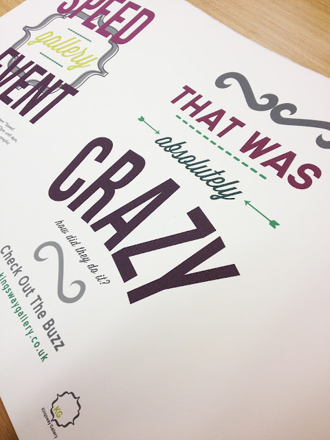
These are the posters being printed and prototypes. For the larger posters I wanted a screen printed look but wasn't able to actually get them screen printed in time, instead I used a thick 300 gsm cotton paper which allowed some bleed in the paper to create a great effect. I had to get this printed in uni using a huge A0 printer which was good to use because the quality is so concise and calibrated, unlike my printer. The project had a strong typography feel as shown in these images below.
These are the posters being printed and prototypes. For the larger posters I wanted a screen printed look but wasn't able to actually get them screen printed in time, instead I used a thick 300 gsm cotton paper which allowed some bleed in the paper to create a great effect. I had to get this printed in uni using a huge A0 printer which was good to use because the quality is so concise and calibrated, unlike my printer. The project had a strong typography feel as shown in these images below.
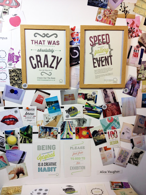
These are some images of the exhibition actually up on the walls, if you haven't read some of the previous posts it is based on a magnetic gallery concept and promoting the Kingsway Gallery on my uni campus. The idea is that people can stick what they want to the walls in order to inspire others all across the campus and promote themselves via the website. To illustrate the point of the piece I went a bit crazy, stripped my walls and covered the whole area in photos, sketches, postcards, polaroids and pieces torn out of magazines and this was the result. The final thing wasn't how I had envisaged, I wanted a cleaner feel to the exhibition but I think it makes an impression.
Subscribe to:
Comments (Atom)


