photo imfresh2_zpsd65868bc.jpg  photo untitledcollection_zps84a740fd.jpg  photo phunk_zpsb7e679f8.jpg  photo havenbrochurecollectivecopy_zpsbcef5f41.png  photo rubanimages_zps7ead41bd.jpg  photo exhibinpractise_zps178c39b5.png  photo finishedruban_zpsd1229a75.jpg  photo tips_zps509f1619.jpg  photo degreeshowopening_zps0f4801ea.jpg  photo lemonstickers2_zps6d8fb7e9.jpg  photo interviewtips_zps56764e69.jpg  photo placement_zpsb679140e.jpg  photo graduation_zps13fcb4f1.jpg

Friday, March 30

D&AD Rain Poster

About a month ago, Erik Kessels of KesselsKramer invited students from northern universities to design a poster promoting rain. This forms part of his northern lecture on April 5th in Manchester for the D&AD. The brief was to make rain "attractive" without being sarcastic; the brief seemed pretty appropriate to me as whenever I am in Manchester it always seems to rain.

Any award by D&AD has such a sense of prestige, so I definitely wanted to enter something. I intended to use typography as the poster would be forming research for another project I am working on also based on type. When devising concepts for the project I was influenced by the work of Saul Bass as he is well known for his combination of type and imagery to great effect.

I decided to base my poster on the children's nursery rhyme "Rain, rain, go away" but making the rain into a positive feature. The poster is intended to be emotive in the way that the clouds behind "rain" look although they are just about to pour down and "wash" looks like a 50's launderette sign. The Saul Bass elements of shape and typography have been added to create further impact to the statement.

After Easter break I want to get the poster screen printed after some adjustments, I don't feel like it is totally finished and needs a lot of work yet, but hopefully will translate well on print. These are a few images as it stands.


Wednesday, March 21

Screenprinting Experimentation

Recently I have been working on two really interesting, fun briefs; one about culture and another D&AD project about the benefits of rain. As the designs for both of these projects have progressed, I have been thinking more and more about screen printing; an old fashioned, manual technique that leaves a beautiful raw finish to prints. It would be the perfect style for both designs and something I have always wanted to experiment with, so, as research I went and had a go today.

I didn't know a lot about the process until today, only that paint is pulled through a fine material mesh to leave areas of paint which becomes the print. The actual method of preparing the screens take at least a day as you have to separate the colours in your print work, let the material be exposed to light and chemicals to create the blocked out sections, and then the paint has to be made up to your specific colours with more chemicals. It takes ages! But, it is so worth if for the great effect you are left with and the depth that can be achieved through layering colours. In this example above the screens have been set with an image of a tweed coat to practise with which looked great when the colours started to create a thick weave effect.

After Easter I am going to make up screens with my own design on and hopefully get some printed, if successful they will go towards my final degree show in June. It was great to have the chance to work with some of these old techniques like screen printing and letterpress because I think it adds a quality you just can't get with digital printing.


Sunday, March 18

Dissertation: Branding & Books

Recently I haven't been posting as much on the blog because I've been busy doing things such as my dissertation and research for various projects, this subsequently does not make for very visually aesthetic blog posts. Despite this, what I have been working on over the past few weeks has been pretty fun and informative.

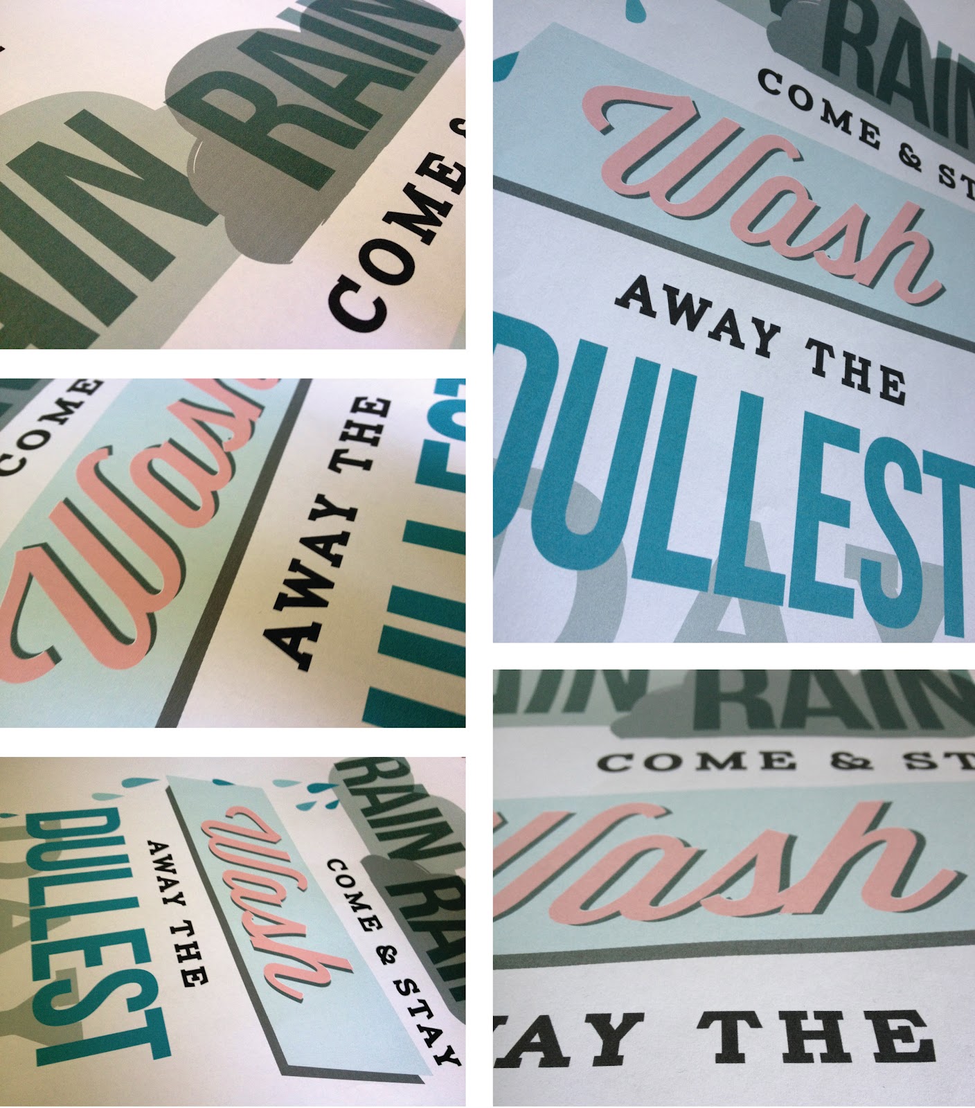
Right now I'm writing my dissertation which is on the topic of supermarket own brand labels and how they have been branded and marketed in order to dispel the stigma of poor quality, focusing particularly on supermarkets' own premium ranges. This year I have worked on three modules regarding branding and really enjoyed the process of identity management and creating suitable concepts for clients. Branding is an area I would like to get involved with in my career because of the diversity and depth of understanding involved in creating an effective solution for a range of clients.

While working on my dissertation I have used a load of books; this is just a pick of some of the best ones I found. I would really love to hear about any useful branding books people may know of so please comment or email me.


Own Label by Jonny Trunk: I have talked about this book before; it's a great resource for retro packaging designs and just a pretty interesting read. The number of packaging examples within this book is so extensive; it's worth buying just to see them all. It also goes on to talk about how supermarkets responded to social change such as the post WWII consumer and developing quality control.

Trolley Wars by Judi Bevan: This book is very descriptive and written in such a way that the information becomes woven into a kind of story, so much so that you forget this book is about facts. It reads like a Hotel Babylon of the supermarket world which is weirdly absorbing and questions the integrity of some chains.

Buying In by Rob Walker: Like Trolley Wars, this book is written in smooth prose which makes it easy to forget you are reading for research. Walker uses great examples to break down some of the confusing terms in a way that even I can understand, using theory and case studies to determine why we buy what we buy.

Supermarket Own Brand Guide by Martin Isark: I got this book because I thought it would be a good supplement to my essay, it include prices and nutrition of products at a range of the leading supermarkets. After reading through it really does show that all the supermarket price war is over a few pence and that effective branding, marketing and packaging are the real reasons for choosing the products that we do.

Tuesday, March 6

"Untitled" Degree Show Ident

For our final degree show in June the design committee, who are responsible for naming, funding and organising the show, have chosen to call it "Untitled". When I first heard this on monday I was pretty disappointed with the lack of imagination and thought that had gone into this choice. Students in third year, like myself, were invited to create an ident for the degree show, with the most popular design becoming the branding. With Chester being quite a small university it is vital our degree show branding attracts some attention and lets the public know about the great design being produced.

Despite the relatively generic name of "Untitled" it did allow a lot of freedom when designing an identity for the degree show. It was a great opportunity to create something, exciting, crazy and fun for our show that would make us stand out. With this in mind I chose to make something quirky and vibrant that illustrated "Untitled".