photo imfresh2_zpsd65868bc.jpg  photo untitledcollection_zps84a740fd.jpg  photo phunk_zpsb7e679f8.jpg  photo havenbrochurecollectivecopy_zpsbcef5f41.png  photo rubanimages_zps7ead41bd.jpg  photo exhibinpractise_zps178c39b5.png  photo finishedruban_zpsd1229a75.jpg  photo tips_zps509f1619.jpg  photo degreeshowopening_zps0f4801ea.jpg  photo lemonstickers2_zps6d8fb7e9.jpg  photo interviewtips_zps56764e69.jpg  photo placement_zpsb679140e.jpg  photo graduation_zps13fcb4f1.jpg

Friday, August 31

I'm Fresh #2

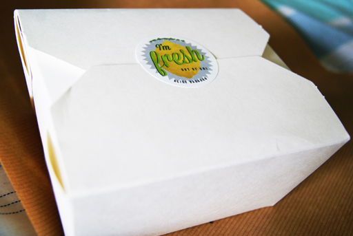
Recently I began my job search by sending out a letter and stickers based on a lemon concept to various companies (see it here). I wanted to create a campaign to send to these design agencies so that I would stand out from what I expect would be thousands of other potential candidates. 

The campaign was based around lemons with "I'm fresh out of university" being the main tag line on the stickers along with lemon illustrations and some lemon based puns. Luckily, I did get some response to my letters but to ensure these companies didn't forget me I began part two of the "I'm Fresh" campaign and sent out another package. 

The new package had to be bold, interesting and attention grabbing. To achieve these criteria I wrote another letter, included a CV, more stickers and a lemon then neatly packed it into a box and sent it off yesterday evening by special delivery. Hopefully they will arrive on somebody's desk sometime today. 

I spent a lot of time and effort getting this package to look right and i'm hoping this is reflected. 


Wednesday, August 29

"Write On" Writing Set

This is a slightly unusual post for me (especially as I'm getting to grips with writing on an iPad) about a product I recently came across at Oxfam.

If you follow me on twitter you will know I am always collecting old, interesting books to scan and use in projects. While hunting for some of these old books I found this cool product and I thought it was deserving of a blog post.

The product itself is a writing set made out of recycled wrapping paper and includes 10 sheets and envelopes in a neatly bound package. I always tend to think of charity products as quite bland and far from exciting design wise, but this definitely caught my eye. It's not unlike something you might come across in fashionable stationary shops such as Paperchase (if fashionable stationary is even a thing?)

The product is not only beautiful it is also environmentally friendly, charity supporting and functional. Attributes that I think all designers should be aware of in their own work.

With the dominance of emails today, handwritten letters can convey a personal touch not achieved through digital communication and a pack like this definitely encourages me to write a bit more and type a bit less. 


Tuesday, August 21

Found Designs #3

Following previous posts along a similar theme (see here & here) I have collated more of my iPhone photos into a "Found Designs" blog post. These posts, as implied, are interesting illustrations, packaging and typography examples I have found while out and about.


My favourite designs here are a postcard from Aberystwyth using old style typefaces with an impressionist style painting to give a suggestion of the vintage sea side era.

A beautiful typeface on a memorial plaque I came across while walking my dog.

Interesting packaging design for some chocolates. The box uses foils to give the box a sense of luxury in contrast with a modern style of the package and typography.


Tuesday, August 14

I'm Fresh

Having recently graduated from university, I am seeking employment in my chosen career field of design. Like many of my peers, I have carefully researched before deciding where to take my next step forward on the job market. But I believe you have to be a bit more proactive, making your career happen instead of simply waiting for it to arrive.
With this in mind, I complied a self promotional pack to send to a small, select group of companies I have come across via twitter, in design articles or through word of mouth. These companies produce work that is dynamic, innovative and highly creative; agencies I would dream of designing for. 

The pack itself is based on a lemon concept; lemons are fresh, zesty and sharp. Similarly, these are the attributes of an enthusiastic and thoughtful designer, which I aim to portray through these self promotional items.

The pack contains a covering letter with illustrations, my CV and some stickers all tied together with my lemon influenced branding.

The design style used for this pack is inspired by old typefaces and vintage signage; something I admire and refer to in my personal work. I felt it was important that these letters and stickers convey my own taste and give a reflection of me as a designer. To finish, the letters were placed in a brown envelope to emulate a grocery bag and continue with the lemon theme, before finally being sealed with a sticker.

I hope to receive some positive and constructive feedback from my chosen agencies, I will to keep the blog updated with any news. Fingers crossed!