If you read this blog you will know a few things about me; firstly, that I have just graduated with a degree in graphic design and secondly, I am looking for a job within this industry. In pursuit of a job I have made a conscious effort to promote myself to a wider audience through my website, this blog and my twitter account, hoping that the right audience will find me.
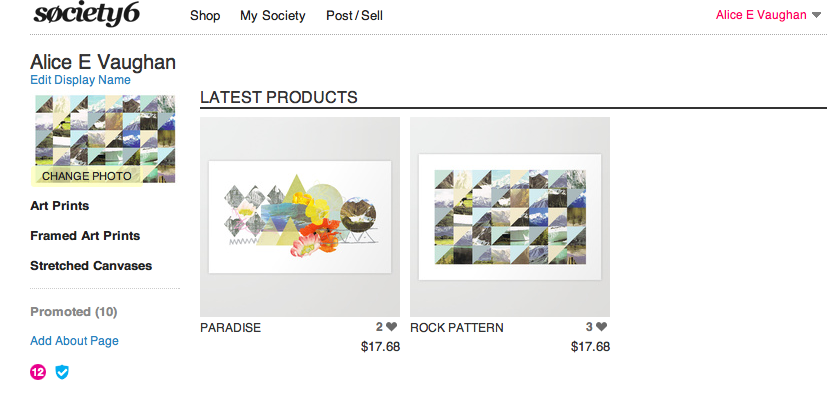
Today I added to my self promotional channels by setting up a Society 6 account under the name "Alice E Vaughan", the same as my twitter account. If you don't know, Society 6 is a web based company where designers and artists post their work on the site and Society 6 makes it into prints/iphone cases/canvases ect. All you have to do is set your profit per item and advertise all your designs. Members of the site can also "promote" your work, similar to the "like" button function on Facebook.
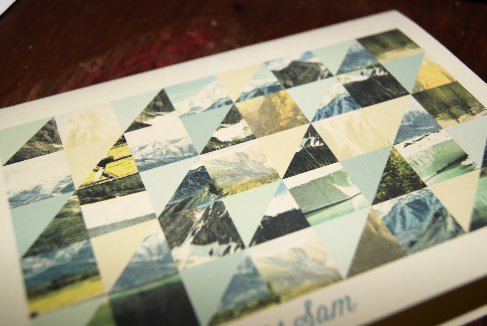
Being a relative newbie to the whole process I have only uploaded two prints, which have both featured on this blog before, as a trial run. The whole concept of my own Society 6 account is an experiment in promotion and pricing my own work. I am hoping to add more prints and designs after becoming more knowledgeable about the process, so keep posted.
If you would like to see my work or buy a print you can now do so here!
Showing posts with label Collage. Show all posts
Monday, July 23
Saturday, July 21
Self Promotional Illustration
For a while I have been debating on wether to change my blog from dynamic view (how it is at present) to simple view which would allow me much more freedom over the layout. I really like the dynamic view as it prioritises images to make the home page visually exciting, and, of course, it's very user friendly. But, there is a lot of restriction in terms of personalising the page.
I decided to create an illustrative piece that will act as a header for the blog for two reasons. Firstly because the illustration could work as my new header bar for my blog when viewed in mobile and secondly, I really enjoy creating this style of illustration so it's no hardship to spend time doing so.
While I am preparing my blog, website and CV for job applications I am really keen to put my own personal stamp on every aspect of my web presence; and this header could be enough of a feature to achieve this and made me stand out from the crowd.
These are some images of the print out and then on my blog viewed through my mobile.
I decided to create an illustrative piece that will act as a header for the blog for two reasons. Firstly because the illustration could work as my new header bar for my blog when viewed in mobile and secondly, I really enjoy creating this style of illustration so it's no hardship to spend time doing so.
While I am preparing my blog, website and CV for job applications I am really keen to put my own personal stamp on every aspect of my web presence; and this header could be enough of a feature to achieve this and made me stand out from the crowd.
These are some images of the print out and then on my blog viewed through my mobile.
Tuesday, May 22
Haven Brochure
I have been really bad at updating my blog lately because of the run up to final third year deadlines. Later on today I will be handing in my double credit module for which I did two briefs; British brief, which I will blog about later, and The Haven brief which I have mentioned before here.
This is one of the artefacts I produced for this project; an information brochure. The Haven is a small breast cancer charity that offers a complementary service of treatments. The real issues they were having were not being able to contact the relevant target audience, which was not helped by poorly designed information packs. As part of this brief I redesigned an element of their information pack and created some illustrations.
Tuesday, May 1
Finished Ruban
I've spoken about "Ruban" a few times in other posts that i've done (here and here) explaining the concept and what it requires. I really loved doing this project because it was inspired by some amazing design pieces I had seen in IDN, and it was great to actually do something similar myself.
The project was planned to last two months, but due to other commitments, as both myself and Abbie are final year Graphic Design students, the project only lasted one month. However, in that short time we managed to produce a range of pieces which can be used in our portfolios.
I would like to add the project to my portfolio and present it in a similar way to the work on Society 6, as a graphic illustration project. These are my final four images that I came up with.
The project was planned to last two months, but due to other commitments, as both myself and Abbie are final year Graphic Design students, the project only lasted one month. However, in that short time we managed to produce a range of pieces which can be used in our portfolios.
I would like to add the project to my portfolio and present it in a similar way to the work on Society 6, as a graphic illustration project. These are my final four images that I came up with.
Tuesday, March 6
"Untitled" Degree Show Ident
For our final degree show in June the design committee, who are responsible for naming, funding and organising the show, have chosen to call it "Untitled". When I first heard this on monday I was pretty disappointed with the lack of imagination and thought that had gone into this choice. Students in third year, like myself, were invited to create an ident for the degree show, with the most popular design becoming the branding. With Chester being quite a small university it is vital our degree show branding attracts some attention and lets the public know about the great design being produced.
Despite the relatively generic name of "Untitled" it did allow a lot of freedom when designing an identity for the degree show. It was a great opportunity to create something, exciting, crazy and fun for our show that would make us stand out. With this in mind I chose to make something quirky and vibrant that illustrated "Untitled".
Monday, February 27
Ruban In Progress
As I had said in some of my previous posts, I have been working on a project called Ruban; this involves creating a digital collage, contrasting urban with rural imagery. Each week my friend and I exchange designs with a 250 word rationale then spend the following week responding to their collage. This week I have been working on my response with the theme of contrasting the geometric styles of architecture with natural images. These are some images of the work in progress.
Saturday, December 24
Christmas Cards
A few months ago I was given "Cutting Edges" by Gestalten which is a really great book about digital collage. I have had an affinity with digital collage since coming across the amazing work of Ciara Phelan a little over a year ago. The book explores a range of collage styles and designers and the methods they use, it is quite humorous with unusual composition of subject matter in some pieces. I love the surrealist nature of collage and the nostalgic influences that runs through the book, which influenced a series of my own Christmas cards.
Christmas cards can be quite cliched and banal as the subject matter tends to reference snow or festive plants, so I wanted to create something that would be a bit more creative yet still retain a winter feel. Using the "Cutting Edges" book as a source, I made some christmas cards.
Subscribe to:
Posts (Atom)