photo imfresh2_zpsd65868bc.jpg  photo untitledcollection_zps84a740fd.jpg  photo phunk_zpsb7e679f8.jpg  photo havenbrochurecollectivecopy_zpsbcef5f41.png  photo rubanimages_zps7ead41bd.jpg  photo exhibinpractise_zps178c39b5.png  photo finishedruban_zpsd1229a75.jpg  photo tips_zps509f1619.jpg  photo degreeshowopening_zps0f4801ea.jpg  photo lemonstickers2_zps6d8fb7e9.jpg  photo interviewtips_zps56764e69.jpg  photo placement_zpsb679140e.jpg  photo graduation_zps13fcb4f1.jpg
Showing posts with label Branding. Show all posts

Friday, January 11

General Updates

I have been getting up to lots of things lately, so to save four short blog posts I have condensed it all down into one little post with bite sized pieces. Like with any catch up you always have to have a hot drink, which explains the image, obviously.


Image sourced from here


1. You may have noticed that my blog has had a slight make over recently and now has more of a personal feel. Changing the layout is something I have been wanting to do for a long time yet not really got round to, I am keen to have both my website and blog use quite a consistent theme and I think this is a good match. Over time I hope to tweak and improve both to create a better synergy between all my digital presences.

2. Post placement I have been applying for lots more jobs and Internships (as usual). My placement at Big in December opened my eyes to lots of possibilities and this week I've really had an "I've got nothing to loose" mentality and applied and emailed people about a whole range of opportunities. My aim is to try lots of different things, not necessarily design, and just gain as much experience as possible by trying new things. So far i'm enjoying it.

3. My good pal Alex is owner of Albatross Clothing; an ethical clothing company with morals at the heart of everything they do. This week I have been working up designs for a new apparel range after receiving an invite to submit work.

Apparel design is not something I know a lot about but I definitely wanted to have an emphasis of fun in the designs I created as the Albatross audience is young people. Once focus group research has been completed I will hopefully know if these designs will be going forward to be sold under the Albatross brand. Fingers crossed the designs make the cut!

4. Finally I have been working on some freelance projects. The first is for an accounting firm which really came about by lucky coincidence, hopefully I can provide something that will really work for them a their brief was quite vague and I have a few ideas I want to pursue.

So that really concludes general updates. Hopefully some exciting things will start happening next week :)


Monday, September 10

Updates: Books & Website

This post is a general round up of a few things I have been working on, looking at and trying to do. My current main aim is trying to find a job within the design industry, balanced between some freelance projects and my less exciting day job. I am trying to make a conscious effort to keep integrated with design and new projects so this is a short round up of some thoughts and designs.

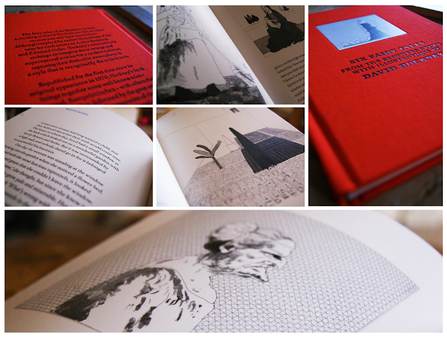
First up is a book that I was recently given by my friend Abbie, a friend and fellow designer. The book itself is a collection of six fairytales by The Brothers Grimm with illustrations from David Hockney, if you don't know who David Hockney is then you should definitely check out his work here (he's kind of a big deal).

The stories are very traditional and stick with the Brother Grimm heritage as some are quite gruesome. The main focus for me are the illustrations which are intricate and finely detailed; perfectly suited to the imaginative and magical stories. See some photos below.


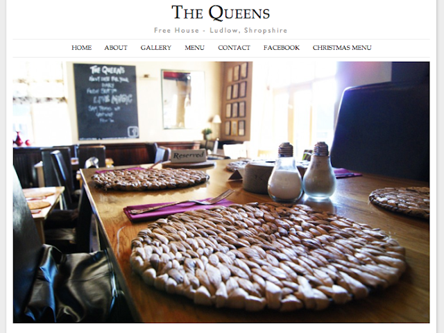
Secondly I have been working on a new website; when I'm not trying to be a graphic designer I am working at my parents pub as a waitress and barmaid. Recently I was able to merge the two and create a new website for the pub using some of my basic, but improving web design skills.

The pub is called The Queens and you can visit the site at www.thequeensludlow.com. The site is mainly finished but subject to some tweaking so be aware that changes are being made to improve the site constantly.

I was aiming for a clean look punctuated with images which I think has been achieved. My next step is to make the gallery more user interactive as currently the images can't be selected.


Thirdly, I have been searching for jobs and following up contact I made with companies regarding my lemon letters and lemon post. Last tuesday I went to visit one of the companies who kindly invited me for a portfolio review which was great to feel like I have made some kind of impression and getting positive feedback. Finding a job, especially your first job after graduation can be tricky but I'm hoping persistence will pay off and I will get somewhere in the near future.

Tuesday, August 14

I'm Fresh

Having recently graduated from university, I am seeking employment in my chosen career field of design. Like many of my peers, I have carefully researched before deciding where to take my next step forward on the job market. But I believe you have to be a bit more proactive, making your career happen instead of simply waiting for it to arrive.
With this in mind, I complied a self promotional pack to send to a small, select group of companies I have come across via twitter, in design articles or through word of mouth. These companies produce work that is dynamic, innovative and highly creative; agencies I would dream of designing for. 

The pack itself is based on a lemon concept; lemons are fresh, zesty and sharp. Similarly, these are the attributes of an enthusiastic and thoughtful designer, which I aim to portray through these self promotional items.

The pack contains a covering letter with illustrations, my CV and some stickers all tied together with my lemon influenced branding.

The design style used for this pack is inspired by old typefaces and vintage signage; something I admire and refer to in my personal work. I felt it was important that these letters and stickers convey my own taste and give a reflection of me as a designer. To finish, the letters were placed in a brown envelope to emulate a grocery bag and continue with the lemon theme, before finally being sealed with a sticker.

I hope to receive some positive and constructive feedback from my chosen agencies, I will to keep the blog updated with any news. Fingers crossed!


Wednesday, July 18

Prima Oliva Branding

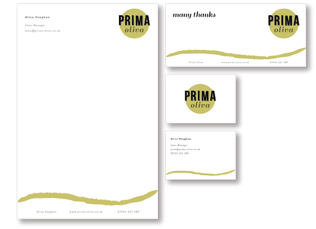
A friend recently approached me about helping him rebrand his company; Prima Oliva. The company makes and sells specialist olive oils to wholesalers, restaurants and pubs. The brief was quite open so there were plenty of avenues to research and explore first. After some research and developing a logo I came up with this.

The new design takes reference from traditional olive oil bottles and street sinage, combined with a clean style to give a modern and sophisticated approach. The colour palette was key to make the new branding relevant to the company as the light greens and yellows can be associated with the olives, olive trees and the oil. 

This is a super quick mockup of some potential letter heads, business cards and compliments slips that will create a clean and consistent brand for the company.


Saturday, June 23

Postcards Printed

As I mentioned yesterday, the degree show exhibition is now underway after the opening night on Thursday. If you read this blog you might of seen me talking about my involvement in the show here.

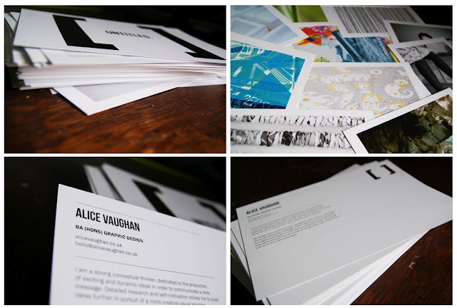
Most degree shows have a catalogue with all the exhibiting artists in, a statement from them and an accompanying image. For our show we decided to have individual postcards, and it was my job to gather, edit, chase people up and make all 83 of these postcards, with the help of my good friends Nic and Lorna.

This was pretty stressful task on top of finishing my own degree as time was tight and there was lots to do. The whole process was a good experience in organising a large group of people and dealing with some difficult customers, which will hopefully be useful in industry.

Despite all this we did it and they came out looking really smart. I had been worrying on the drive up to the opening that they wouldn't live up to my expectations, but I was pleased with the clean style that linked in with our show branding perfectly.


Tuesday, June 12

Graphic Design for Fashion & Internships

During the three years I have been studying graphic design at uni I have acquired a number of great design books and magazines. I really enjoy adding to my collection because books are a great reference and I always find myself coming back to them for inspiration, like in this case.

A few months ago I got Graphic Design for Fashion by Jay Hess and Simon Pasztorek. I don't consider myself into fashion, but was interested in the freedom for experimentation allowed to these designers in order to produce something theatrical for fashion houses such as Preen and Kenzo.

The book is a beautiful example of branding, lookbooks and invitations in a range of styles and concepts. One of my favourite examples is an invitation by Roanne Adams for Bodkin. The Bodkin show was set at the Horticultural Society in New York and the invitation held a small plant in a paper tetrahedron which could be folded flat (pictured). 

Examples of such clever design inspired me to come up with some exciting ideas to send to potential employers and internships to showcase my conceptual thinking. It has become essential to present yourself as a designer in a diverse and exciting way in order to stand out from the crowd. Hopefully I can achieve this by creating something fresh and exciting. 

Sunday, March 18

Dissertation: Branding & Books

Recently I haven't been posting as much on the blog because I've been busy doing things such as my dissertation and research for various projects, this subsequently does not make for very visually aesthetic blog posts. Despite this, what I have been working on over the past few weeks has been pretty fun and informative.

Right now I'm writing my dissertation which is on the topic of supermarket own brand labels and how they have been branded and marketed in order to dispel the stigma of poor quality, focusing particularly on supermarkets' own premium ranges. This year I have worked on three modules regarding branding and really enjoyed the process of identity management and creating suitable concepts for clients. Branding is an area I would like to get involved with in my career because of the diversity and depth of understanding involved in creating an effective solution for a range of clients.

While working on my dissertation I have used a load of books; this is just a pick of some of the best ones I found. I would really love to hear about any useful branding books people may know of so please comment or email me.


Own Label by Jonny Trunk: I have talked about this book before; it's a great resource for retro packaging designs and just a pretty interesting read. The number of packaging examples within this book is so extensive; it's worth buying just to see them all. It also goes on to talk about how supermarkets responded to social change such as the post WWII consumer and developing quality control.

Trolley Wars by Judi Bevan: This book is very descriptive and written in such a way that the information becomes woven into a kind of story, so much so that you forget this book is about facts. It reads like a Hotel Babylon of the supermarket world which is weirdly absorbing and questions the integrity of some chains.

Buying In by Rob Walker: Like Trolley Wars, this book is written in smooth prose which makes it easy to forget you are reading for research. Walker uses great examples to break down some of the confusing terms in a way that even I can understand, using theory and case studies to determine why we buy what we buy.

Supermarket Own Brand Guide by Martin Isark: I got this book because I thought it would be a good supplement to my essay, it include prices and nutrition of products at a range of the leading supermarkets. After reading through it really does show that all the supermarket price war is over a few pence and that effective branding, marketing and packaging are the real reasons for choosing the products that we do.

Tuesday, March 6

"Untitled" Degree Show Ident

For our final degree show in June the design committee, who are responsible for naming, funding and organising the show, have chosen to call it "Untitled". When I first heard this on monday I was pretty disappointed with the lack of imagination and thought that had gone into this choice. Students in third year, like myself, were invited to create an ident for the degree show, with the most popular design becoming the branding. With Chester being quite a small university it is vital our degree show branding attracts some attention and lets the public know about the great design being produced.

Despite the relatively generic name of "Untitled" it did allow a lot of freedom when designing an identity for the degree show. It was a great opportunity to create something, exciting, crazy and fun for our show that would make us stand out. With this in mind I chose to make something quirky and vibrant that illustrated "Untitled".

Saturday, February 18

Postcards

As usual I have been really bad at keeping my blog updated, so i'm trying to keep it updated more often. Anyway, as I have said in a previous post I have been working on my exhibition that forms part of my "Identity Design" module. The brief was to rebrand our uni campus and work on one specific area; I choose to rebrand the campus gallery which is hardly used and is such an awesome space. The main concept is using magnetic strips to allow students to put their work up or anything that inspires them, in an informal way that isn't abrasive and can be easily changed, to complement this idea I created a website, promotional post items, stickers, posted promotions, posters and a style guide.

These are some pictures of the postcards to be used as promotional items, inviting people to visit the website and generate publicity for exhibitions at Kingsway Gallery. I had them printed at moo.com which are usually great and super fast, one of the postcards was slightly smudged but generally the print quality was pretty good. Managed to get my SLR back from my brother so here are some better quality photos.


Tuesday, December 27

Logo Design

Through a design project at university I got in touch with the people from the computer science department, helping them out with design work and creating some illustrations. It's been fun working on more web based projects as I haven't had a chance to work in that area before. To start with i've been making some web illustrations and a logo design for this great website on html 5. You can visit the website and see the design work live at http://www.html5tuts.co.uk/

As well as logo design i'm also working on some web banners for a similar project, it's been a challenge to visualise SEO and web analysis for users that may not understand these terms. It's a really useful and creative project to be involved with and I hope to work with the department further.