This past week I have been enjoying my first week of placement as Big Communications in Leicester as a graphic designer. My previous blog posts had charted my application and interview so it seems only right that I post a quick update on how my placement has been going so far...
This week I have been working on emailers, livery, print work and branding so it has been a really varied few days but great for experiencing a whole range of tasks in a short space of time. I think I have been keeping up with the fast paced work place well and loved that I was working on real life campaigns that might actually be used!
I hadn't had a great deal of real studio experience beforehand so it was a steep learning curve the first few days as to how the studio functioned. Many of the people in the creative team work in pairs of copywriter and art director; something I was aware of but had never experienced first hand before so took the opportunity to quiz an interning copywriter and art director on their experiences. I was interested to find that both had studied graphic design (as I had) but diversified into their new roles. It made me feel positive about the various opportunities I could expand into in the future if I wanted.
In general I have had a productive, educational, creative and fun week. Being on placement has really taught me so much in such a short space of time and it's really satisfying to do a job that I have been trained for and working towards for 3 years, especially with such a respected and successful agency.
One of the benefits aside from the actual creative work is meeting like minded creatives and being able to have a fun work environment as well as a creative and interesting job.
N.B I didn't wan't to shove an SLR in peoples' faces on my first few days so decided to include this quote from one of my favourite designers, Saul Bass (from here) that I think is quite apt.
The poster is taken from my Pinterest board "Inspiration" which you can follow for typographic and design based pins.
Showing posts with label Identity. Show all posts
Saturday, December 1
Monday, October 22
Fashion Brief
I have been having a bit of a blog break recently as applying for jobs doesn't make for very interesting reading and I'm starting to bore myself talking and obsessing over applications, emails and CVs. Although I haven't been actively seeking employment for a really long time (about two months) it certainly can be demoralising when people don't call back and you need to come up with renewed enthusiasm.
With this in mind I was very pleasantly surprised to find an email in my inbox last week asking me to participate in a brief as part of the interview process for a well known clothing company that were known for their boots (which I now want a pair of) and their links to New England. The brief was to creative five t-shirt designs, two heritage themed and two illustrative "earth keeper" designs that related to the importance of the environment.
The brief sounded perfect as the heritage part of the brief was typography based and influenced by vintage signage, two things I really like and use in my own work. So I set to work researching, sketching and coming up with some designs that would reflect the nature of the company; something I could visualise on their t-shirts.
With this brief I tried to give the "client" what they wanted and reflected their company and then some designs that were a little more outside their comfort zone in the "earth keeper" illustrations as I was encouraged to be a bit more inventive. The deadline was this morning so I sent a PDF of the designs and explanations to the company last night, I think the designs I created were suitable and creative but wether I'll be invited to go further in the interview process? I'm not sure.
Anyway, here are a few pictures of the designs and works in progress.
With this in mind I was very pleasantly surprised to find an email in my inbox last week asking me to participate in a brief as part of the interview process for a well known clothing company that were known for their boots (which I now want a pair of) and their links to New England. The brief was to creative five t-shirt designs, two heritage themed and two illustrative "earth keeper" designs that related to the importance of the environment.
The brief sounded perfect as the heritage part of the brief was typography based and influenced by vintage signage, two things I really like and use in my own work. So I set to work researching, sketching and coming up with some designs that would reflect the nature of the company; something I could visualise on their t-shirts.
With this brief I tried to give the "client" what they wanted and reflected their company and then some designs that were a little more outside their comfort zone in the "earth keeper" illustrations as I was encouraged to be a bit more inventive. The deadline was this morning so I sent a PDF of the designs and explanations to the company last night, I think the designs I created were suitable and creative but wether I'll be invited to go further in the interview process? I'm not sure.
Anyway, here are a few pictures of the designs and works in progress.
Monday, September 10
Updates: Books & Website
This post is a general round up of a few things I have been working on, looking at and trying to do. My current main aim is trying to find a job within the design industry, balanced between some freelance projects and my less exciting day job. I am trying to make a conscious effort to keep integrated with design and new projects so this is a short round up of some thoughts and designs.
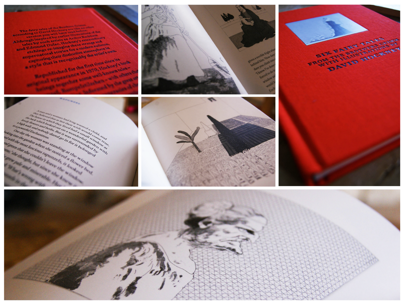
First up is a book that I was recently given by my friend Abbie, a friend and fellow designer. The book itself is a collection of six fairytales by The Brothers Grimm with illustrations from David Hockney, if you don't know who David Hockney is then you should definitely check out his work here (he's kind of a big deal).
The stories are very traditional and stick with the Brother Grimm heritage as some are quite gruesome. The main focus for me are the illustrations which are intricate and finely detailed; perfectly suited to the imaginative and magical stories. See some photos below.
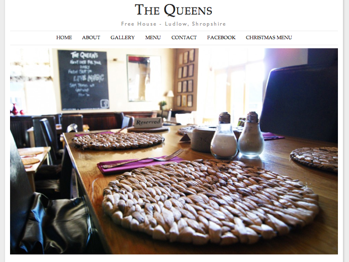
Secondly I have been working on a new website; when I'm not trying to be a graphic designer I am working at my parents pub as a waitress and barmaid. Recently I was able to merge the two and create a new website for the pub using some of my basic, but improving web design skills.
The pub is called The Queens and you can visit the site at www.thequeensludlow.com. The site is mainly finished but subject to some tweaking so be aware that changes are being made to improve the site constantly.
I was aiming for a clean look punctuated with images which I think has been achieved. My next step is to make the gallery more user interactive as currently the images can't be selected.
Thirdly, I have been searching for jobs and following up contact I made with companies regarding my lemon letters and lemon post. Last tuesday I went to visit one of the companies who kindly invited me for a portfolio review which was great to feel like I have made some kind of impression and getting positive feedback. Finding a job, especially your first job after graduation can be tricky but I'm hoping persistence will pay off and I will get somewhere in the near future.
First up is a book that I was recently given by my friend Abbie, a friend and fellow designer. The book itself is a collection of six fairytales by The Brothers Grimm with illustrations from David Hockney, if you don't know who David Hockney is then you should definitely check out his work here (he's kind of a big deal).
The stories are very traditional and stick with the Brother Grimm heritage as some are quite gruesome. The main focus for me are the illustrations which are intricate and finely detailed; perfectly suited to the imaginative and magical stories. See some photos below.
Secondly I have been working on a new website; when I'm not trying to be a graphic designer I am working at my parents pub as a waitress and barmaid. Recently I was able to merge the two and create a new website for the pub using some of my basic, but improving web design skills.
The pub is called The Queens and you can visit the site at www.thequeensludlow.com. The site is mainly finished but subject to some tweaking so be aware that changes are being made to improve the site constantly.
I was aiming for a clean look punctuated with images which I think has been achieved. My next step is to make the gallery more user interactive as currently the images can't be selected.
Friday, August 31
I'm Fresh #2
Recently I began my job search by sending out a letter and stickers based on a lemon concept to various companies (see it here). I wanted to create a campaign to send to these design agencies so that I would stand out from what I expect would be thousands of other potential candidates.
The campaign was based around lemons with "I'm fresh out of university" being the main tag line on the stickers along with lemon illustrations and some lemon based puns. Luckily, I did get some response to my letters but to ensure these companies didn't forget me I began part two of the "I'm Fresh" campaign and sent out another package.
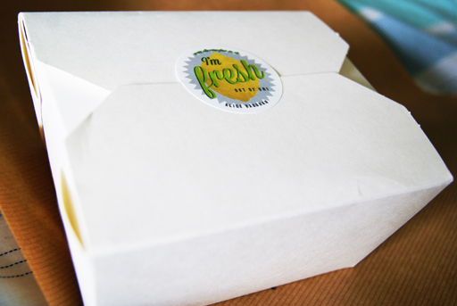
The new package had to be bold, interesting and attention grabbing. To achieve these criteria I wrote another letter, included a CV, more stickers and a lemon then neatly packed it into a box and sent it off yesterday evening by special delivery. Hopefully they will arrive on somebody's desk sometime today.
I spent a lot of time and effort getting this package to look right and i'm hoping this is reflected.

Tuesday, August 14
I'm Fresh
Having recently graduated from university, I am seeking employment in my chosen career field of design. Like many of my peers, I have carefully researched before deciding where to take my next step forward on the job market. But I believe you have to be a bit more proactive, making your career happen instead of simply waiting for it to arrive.
The pack contains a covering letter with illustrations, my CV and some stickers all tied together with my lemon influenced branding.
The design style used for this pack is inspired by old typefaces and vintage signage; something I admire and refer to in my personal work. I felt it was important that these letters and stickers convey my own taste and give a reflection of me as a designer. To finish, the letters were placed in a brown envelope to emulate a grocery bag and continue with the lemon theme, before finally being sealed with a sticker.
I hope to receive some positive and constructive feedback from my chosen agencies, I will to keep the blog updated with any news. Fingers crossed!
With this in mind, I complied a self promotional pack to send to a small, select group of companies I have come across via twitter, in design articles or through word of mouth. These companies produce work that is dynamic, innovative and highly creative; agencies I would dream of designing for.
The pack itself is based on a lemon concept; lemons are fresh, zesty and sharp. Similarly, these are the attributes of an enthusiastic and thoughtful designer, which I aim to portray through these self promotional items.
The design style used for this pack is inspired by old typefaces and vintage signage; something I admire and refer to in my personal work. I felt it was important that these letters and stickers convey my own taste and give a reflection of me as a designer. To finish, the letters were placed in a brown envelope to emulate a grocery bag and continue with the lemon theme, before finally being sealed with a sticker.
I hope to receive some positive and constructive feedback from my chosen agencies, I will to keep the blog updated with any news. Fingers crossed!
Friday, July 13
New Website
Over the past few months I have been meaning to redesign my website, but with finishing uni and hand ins it has been pushed further and further down my to do list. But finally, after constant tweaking and getting distracted by facebook/twitter/BBC news it is finished (see it here) ! Whenever I need information I always turn to Google first, so not have a web presence means missing such a large potential audience. Feel free to visit my site and give me some constructive feedback at www.alicevaughan.co.uk
I wanted the look of the website to be clean and simple, punctuated with the vibrancy of my images, which I think I have achieved. In general I am quite pleased with the outcome, but undoubtedly I will end up messing around with it as I have a tendency to obsess, mess and improve my website continually.
In other news I have been rubbish at updating my blog lately due to the massive upheaval from uni life back to home life. This combined with some people in my life leaving and some returning means that I haven't had a chance to sit down and actually design or blog anything. But in truth the short break has been kind of nice after a mad May/June :).
I will be making a effort to keep my blog updated as I begin searching for a graphic design job (woah) and improve my portfolio.
I wanted the look of the website to be clean and simple, punctuated with the vibrancy of my images, which I think I have achieved. In general I am quite pleased with the outcome, but undoubtedly I will end up messing around with it as I have a tendency to obsess, mess and improve my website continually.
In other news I have been rubbish at updating my blog lately due to the massive upheaval from uni life back to home life. This combined with some people in my life leaving and some returning means that I haven't had a chance to sit down and actually design or blog anything. But in truth the short break has been kind of nice after a mad May/June :).
I will be making a effort to keep my blog updated as I begin searching for a graphic design job (woah) and improve my portfolio.
Tuesday, June 12
Graphic Design for Fashion & Internships
During the three years I have been studying graphic design at uni I have acquired a number of great design books and magazines. I really enjoy adding to my collection because books are a great reference and I always find myself coming back to them for inspiration, like in this case.
A few months ago I got Graphic Design for Fashion by Jay Hess and Simon Pasztorek. I don't consider myself into fashion, but was interested in the freedom for experimentation allowed to these designers in order to produce something theatrical for fashion houses such as Preen and Kenzo.
The book is a beautiful example of branding, lookbooks and invitations in a range of styles and concepts. One of my favourite examples is an invitation by Roanne Adams for Bodkin. The Bodkin show was set at the Horticultural Society in New York and the invitation held a small plant in a paper tetrahedron which could be folded flat (pictured).
Examples of such clever design inspired me to come up with some exciting ideas to send to potential employers and internships to showcase my conceptual thinking. It has become essential to present yourself as a designer in a diverse and exciting way in order to stand out from the crowd. Hopefully I can achieve this by creating something fresh and exciting.
Tuesday, March 6
"Untitled" Degree Show Ident
For our final degree show in June the design committee, who are responsible for naming, funding and organising the show, have chosen to call it "Untitled". When I first heard this on monday I was pretty disappointed with the lack of imagination and thought that had gone into this choice. Students in third year, like myself, were invited to create an ident for the degree show, with the most popular design becoming the branding. With Chester being quite a small university it is vital our degree show branding attracts some attention and lets the public know about the great design being produced.
Despite the relatively generic name of "Untitled" it did allow a lot of freedom when designing an identity for the degree show. It was a great opportunity to create something, exciting, crazy and fun for our show that would make us stand out. With this in mind I chose to make something quirky and vibrant that illustrated "Untitled".
Subscribe to:
Posts (Atom)