



Showing posts with label Inspiration. Show all posts
Showing posts with label Inspiration. Show all posts
Wednesday, February 27
Inspiration: Chalk Typography
Chalk typography is something I have been coming across a lot lately on my internet travels. I am a big typography fan and the vintage twist to these designs is just the kind of style that I love.
Chalk is an interesting medium as it creates a lovely texture that is so difficult to achieve an accurate replication of on Photoshop. I like the simplicity of one colour balanced with the elaborate designs shown in these images, they definitely create a striking visual centre piece in an office or home.


Friday, December 28
New Years Resolutions
The festivities of Christmas are gone and now people are beginning to look towards New Years Eve and with that comes new years resolutions. Resolutions are the promises we make to ourselves at the start of the new year to ensure success, happiness, health and wealth in the following twelve months. With new years nearly here I have been thinking about my own resolutions, specifically career related ones. So here they are...

1. Get a job.
I talk about getting a job a lot, but more specifically I want to get an awesome job. Gaining experience on placements shows I am willing to learn, better myself and allows me to be more aware of career choices. 2013 will be the year I land a fantastic job because I will work hard, research, learn and get there.
2. Use LinkedIn effectively.
Today I have been busily updating my profile on LinkedIn, connecting with relevant individuals and joining groups. I believe it is important to be up to date with LinkedIn because it allows you to broadcast yourself to the "right people" and meet like minded designers you admire and see how they achieved what they have. In 2013 I will be regularly updating my LinkedIn profile, to be witness to this you can connect with me here.
3. Use my SLR more
I've had my SLR for about two and a half years and in that time it has been primarily used to photograph work for my portfolio. My new years resolution is to learn more about photography, and produce great quality shots. I love the fantastic vibrancy of the photos from the camera so in 2013 I will be more snap happy.
4. Visit more exhibitions, museums and galleries
I have the V&A and The Tate on twitter and regularly hear about the fantastic exhibitions they have on yet rarely go. In 2013 I will make more effort to visit exhibitions, design related or not, in order to inspire myself and experience new things. In January I am hoping to go down to London and definitely want to visit The Natural History Museum and the V&A Ballgowns exhibition.
5. Be successful and have fun
If you have these two factors in your career you can't be doing too badly, so in 2013 I will be aiming for both.

From Here
1. Get a job.
I talk about getting a job a lot, but more specifically I want to get an awesome job. Gaining experience on placements shows I am willing to learn, better myself and allows me to be more aware of career choices. 2013 will be the year I land a fantastic job because I will work hard, research, learn and get there.
2. Use LinkedIn effectively.
Today I have been busily updating my profile on LinkedIn, connecting with relevant individuals and joining groups. I believe it is important to be up to date with LinkedIn because it allows you to broadcast yourself to the "right people" and meet like minded designers you admire and see how they achieved what they have. In 2013 I will be regularly updating my LinkedIn profile, to be witness to this you can connect with me here.
3. Use my SLR more
I've had my SLR for about two and a half years and in that time it has been primarily used to photograph work for my portfolio. My new years resolution is to learn more about photography, and produce great quality shots. I love the fantastic vibrancy of the photos from the camera so in 2013 I will be more snap happy.
4. Visit more exhibitions, museums and galleries
I have the V&A and The Tate on twitter and regularly hear about the fantastic exhibitions they have on yet rarely go. In 2013 I will make more effort to visit exhibitions, design related or not, in order to inspire myself and experience new things. In January I am hoping to go down to London and definitely want to visit The Natural History Museum and the V&A Ballgowns exhibition.
5. Be successful and have fun
If you have these two factors in your career you can't be doing too badly, so in 2013 I will be aiming for both.
Sunday, December 23
Pinterest Picks
I love Pinterest; It's a great way to collate a digital mood board of inspirations and interests that can be simply updated, edited and shared. Many times I have been lacking ideas and turned to Pinterest for much needed inspiration, plus it can link you back to the original source, which is generally very useful.
I am a big fan of typography, hand rendered type and anything remotely retro, which is shown in my Pinterest picks below. If you want to see any of these pins and other similar images follow my "Inspiration" board here.

Possibly one of my favourite pins to date, this simple design showcases type and photography together in a lovely nostalgic way. Although cheesy, I think the message within is also useful to remember.

Similar to the design above, this image touches on the "Hipster Branding" fashion with beautifully constructed type and simple vector shapes.

This image has a Nike feel about it to me, I like the offset effect used to suggest this has been screen printed or similar.

I so wish I was talented at hand rendered type like this image above. I like seeing the pens and paper scattered around the side of the page which shows that great design is not always reliant on digital methods.

Saturday, December 1
Placement Update
This past week I have been enjoying my first week of placement as Big Communications in Leicester as a graphic designer. My previous blog posts had charted my application and interview so it seems only right that I post a quick update on how my placement has been going so far...
This week I have been working on emailers, livery, print work and branding so it has been a really varied few days but great for experiencing a whole range of tasks in a short space of time. I think I have been keeping up with the fast paced work place well and loved that I was working on real life campaigns that might actually be used!
I hadn't had a great deal of real studio experience beforehand so it was a steep learning curve the first few days as to how the studio functioned. Many of the people in the creative team work in pairs of copywriter and art director; something I was aware of but had never experienced first hand before so took the opportunity to quiz an interning copywriter and art director on their experiences. I was interested to find that both had studied graphic design (as I had) but diversified into their new roles. It made me feel positive about the various opportunities I could expand into in the future if I wanted.
In general I have had a productive, educational, creative and fun week. Being on placement has really taught me so much in such a short space of time and it's really satisfying to do a job that I have been trained for and working towards for 3 years, especially with such a respected and successful agency.
One of the benefits aside from the actual creative work is meeting like minded creatives and being able to have a fun work environment as well as a creative and interesting job.
N.B I didn't wan't to shove an SLR in peoples' faces on my first few days so decided to include this quote from one of my favourite designers, Saul Bass (from here) that I think is quite apt.
The poster is taken from my Pinterest board "Inspiration" which you can follow for typographic and design based pins.

This week I have been working on emailers, livery, print work and branding so it has been a really varied few days but great for experiencing a whole range of tasks in a short space of time. I think I have been keeping up with the fast paced work place well and loved that I was working on real life campaigns that might actually be used!
I hadn't had a great deal of real studio experience beforehand so it was a steep learning curve the first few days as to how the studio functioned. Many of the people in the creative team work in pairs of copywriter and art director; something I was aware of but had never experienced first hand before so took the opportunity to quiz an interning copywriter and art director on their experiences. I was interested to find that both had studied graphic design (as I had) but diversified into their new roles. It made me feel positive about the various opportunities I could expand into in the future if I wanted.
In general I have had a productive, educational, creative and fun week. Being on placement has really taught me so much in such a short space of time and it's really satisfying to do a job that I have been trained for and working towards for 3 years, especially with such a respected and successful agency.
One of the benefits aside from the actual creative work is meeting like minded creatives and being able to have a fun work environment as well as a creative and interesting job.
N.B I didn't wan't to shove an SLR in peoples' faces on my first few days so decided to include this quote from one of my favourite designers, Saul Bass (from here) that I think is quite apt.
The poster is taken from my Pinterest board "Inspiration" which you can follow for typographic and design based pins.

Friday, September 21
Updates & The Tate
My blog has suffered a little lately for a range of reasons, one of said reasons is that I had been preparing for a busy week of interviews and meetings and have been working hard to make my portfolio look the best it possibly could.
This week I visited a company that wanted to discuss ways they could promote their 20th anniversary through branding, packaging and promotion and invited me to pitch for the job. This was really exciting as it was something I had little experience of at uni but would definitely be useful for a future in the design industry.
On Tuesday I made my way down to London for an interview about an internship in South Kensington with a small agency that worked with a number of large clients. The interview was more informal than I had been expecting but the interviewer gave me some great feedback which has helped me improve my interview technique.
On Wednesday I got the chance to meet one of the fantastic companies that I had sent my "Lemon Post" to when I was kindly invited to their studio to discuss my portfolio and learn more about the company. Having been to an interview the previous day in London I felt much more prepared and took several work examples, my iPad full with photos and my portfolio. This might seem quite excessive but I was happy to feel that I could answer any question and talk with confidence about my work and my ideas. I felt that the meeting went well and I left a few promotional items with them in the hope they would email me back with some feedback.
It really helped me to research the company in detail beforehand as I could compare my own work to theirs and find similarities and common interests. I think this also shows how much you want to work for the company that you take such an interest.




This week I visited a company that wanted to discuss ways they could promote their 20th anniversary through branding, packaging and promotion and invited me to pitch for the job. This was really exciting as it was something I had little experience of at uni but would definitely be useful for a future in the design industry.
On Tuesday I made my way down to London for an interview about an internship in South Kensington with a small agency that worked with a number of large clients. The interview was more informal than I had been expecting but the interviewer gave me some great feedback which has helped me improve my interview technique.
On Wednesday I got the chance to meet one of the fantastic companies that I had sent my "Lemon Post" to when I was kindly invited to their studio to discuss my portfolio and learn more about the company. Having been to an interview the previous day in London I felt much more prepared and took several work examples, my iPad full with photos and my portfolio. This might seem quite excessive but I was happy to feel that I could answer any question and talk with confidence about my work and my ideas. I felt that the meeting went well and I left a few promotional items with them in the hope they would email me back with some feedback.
It really helped me to research the company in detail beforehand as I could compare my own work to theirs and find similarities and common interests. I think this also shows how much you want to work for the company that you take such an interest.
In general the past few days have been quite successful and I feel that I am getting somewhere with my job hunt and that perseverance and dedication will pay off in the end.
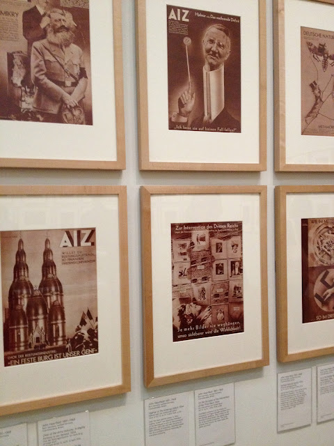
In the mean time these are some photos from The Tate Modern. I particularly enjoyed the new exhibitions in "The Tanks" which you can see here. I do enjoy art but some of the pieces I saw did throw me a bit, but see what you think for yourself and please excuse the iPhone snaps.

St. Pauls


"The Tanks" new Tate exhibition


Jeff Keen's vibrant pop art instillation


Picasso


My mum enjoying the work on show


One of the pieces I found hard to understand...


Cheeky Krispy Kreme at the end of the day
Monday, September 10
Updates: Books & Website
This post is a general round up of a few things I have been working on, looking at and trying to do. My current main aim is trying to find a job within the design industry, balanced between some freelance projects and my less exciting day job. I am trying to make a conscious effort to keep integrated with design and new projects so this is a short round up of some thoughts and designs.
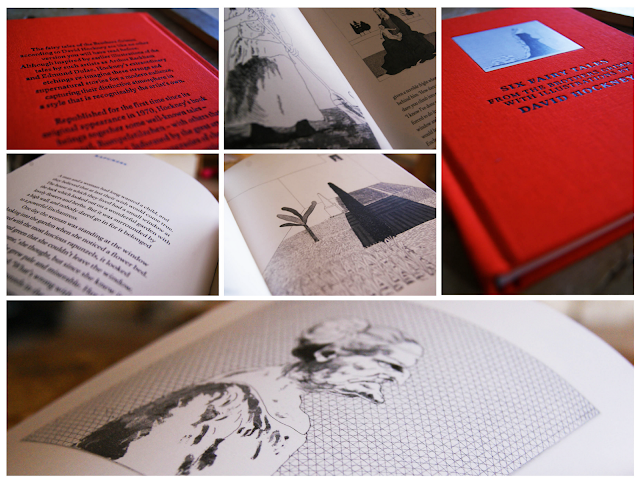
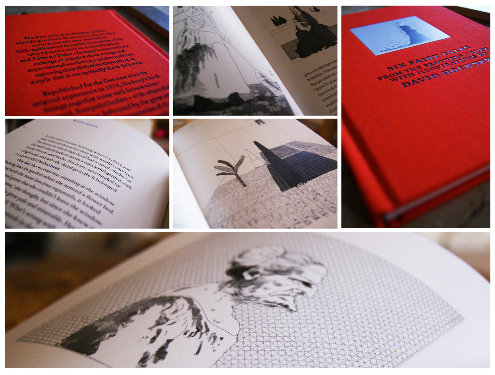
First up is a book that I was recently given by my friend Abbie, a friend and fellow designer. The book itself is a collection of six fairytales by The Brothers Grimm with illustrations from David Hockney, if you don't know who David Hockney is then you should definitely check out his work here (he's kind of a big deal).
The stories are very traditional and stick with the Brother Grimm heritage as some are quite gruesome. The main focus for me are the illustrations which are intricate and finely detailed; perfectly suited to the imaginative and magical stories. See some photos below.
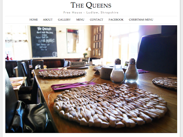
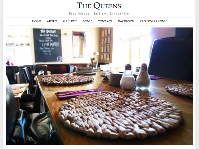
Secondly I have been working on a new website; when I'm not trying to be a graphic designer I am working at my parents pub as a waitress and barmaid. Recently I was able to merge the two and create a new website for the pub using some of my basic, but improving web design skills.
The pub is called The Queens and you can visit the site at www.thequeensludlow.com. The site is mainly finished but subject to some tweaking so be aware that changes are being made to improve the site constantly.
I was aiming for a clean look punctuated with images which I think has been achieved. My next step is to make the gallery more user interactive as currently the images can't be selected.
Thirdly, I have been searching for jobs and following up contact I made with companies regarding my lemon letters and lemon post. Last tuesday I went to visit one of the companies who kindly invited me for a portfolio review which was great to feel like I have made some kind of impression and getting positive feedback. Finding a job, especially your first job after graduation can be tricky but I'm hoping persistence will pay off and I will get somewhere in the near future.
First up is a book that I was recently given by my friend Abbie, a friend and fellow designer. The book itself is a collection of six fairytales by The Brothers Grimm with illustrations from David Hockney, if you don't know who David Hockney is then you should definitely check out his work here (he's kind of a big deal).
The stories are very traditional and stick with the Brother Grimm heritage as some are quite gruesome. The main focus for me are the illustrations which are intricate and finely detailed; perfectly suited to the imaginative and magical stories. See some photos below.
Secondly I have been working on a new website; when I'm not trying to be a graphic designer I am working at my parents pub as a waitress and barmaid. Recently I was able to merge the two and create a new website for the pub using some of my basic, but improving web design skills.
The pub is called The Queens and you can visit the site at www.thequeensludlow.com. The site is mainly finished but subject to some tweaking so be aware that changes are being made to improve the site constantly.
I was aiming for a clean look punctuated with images which I think has been achieved. My next step is to make the gallery more user interactive as currently the images can't be selected.
Thursday, September 6
Ipad Designer Apps #1
For my birthday last week I was fortunate enough to receive an iPad. Of course, like most people I thought they were cool, but how could the be more than just a toy? Although great for films, internet browsing and games, how could I use the iPad to help me as a designer?

I investigated into a few apps and these are some that I think are useful tool to make the iPad work as a tool for designers'.


Evernote
First up is Evernote; essentially a mood board app where by images, internet clippings, recordings and notes can be kept together. Before I downloaded this app I thought it sounded great; as a designer, collecting inspirations and notes can prove invaluable and as the app is free, it was definitely on my download list.
When I started to use the app I found it was very easy to use and explained the features well. The interface is relatively simple so anybody with basic computer knowledge should be able to master Evernote in a matter of minutes.
Pros: Very easy to use, useful app, free and can sync between devices
Cons: Only tiny, but I did find a broken link on the "getting started" page.

PS Express
The Adobe creative suite is the industry standard when it comes to graphic design so I knew whatever app the brought out would be worth downloading. Unfortunately, Adobe don't yet have their creative suite iPad ready but this basic alternative does the trick when it comes to simple image editing.
Users select a photo and can then choose from a range of effects, borders and filters to edit the image. But don't panic! It's not all inverted colours and posterize; you can really achieve some photos if you take the time to play around. I predominately use this programme for simple image editing if I'm using my iPad to blog with.
The only downside to this product are the added cost of some features which you initially presume to be free. Of course, you can just have the app with no added "bundles" but the editing capacity is extremely limited.
Pros: similar interface to other Adobe products, good quality edited images can be achieved.
Cons: Sneaky added "bundles" mean the app is not entirely free. You don't have to add them but you do have more options if you do add them on.
I have tried a few image editing apps for iPad and this is by far the best.

Penultimate (from the makers of Evernote)
A very simple note pad add with a range of different papers, pen colours and pen widths. This app is not a miracle app but it is extremely useful, and the range of squared, lined or plain paper makes it useful for a number of tasks.
You can go onto the "paper shop" and add various other types of papers including music sheets, "Young Writers" paper with extra spaced lines, "games" paper and photo pages. Every added package is 69p but does make the app of much more multi functional.
You can sync Penultimate with Dropbox and Evernote and adjust the many settings to customise the programme to the user.
Pros: Easy to use, range of papers, add more "notebooks" to keep order of your notes, you can also add a photo into the page which can be great for annotations.
Cons: Not many pen colours or widths.
Overall a great little app.

Pinterest
Finally, it's the Pinterest app; I think Pinterest must of been made for iPads because they are perfect partners. Pinterest is designed for internet browsing and inspiration which is made all the better when you can have an iPad on your lap and a tea in your hand as you flick through your "pins" and "likes" with ease. For a designer, having a collection of inspiring images you can so easily view is definitely an app worth having.
Pros: I find Pinterest on the iPad a lot easier than iPhone due to the larger screen and being able to use the touch screen makes it a lot easier than a mac.
Cons: None. It's free and a useful networking tool so what is there not to like?
Get Pinterest here for free

Friday, August 31
I'm Fresh #2
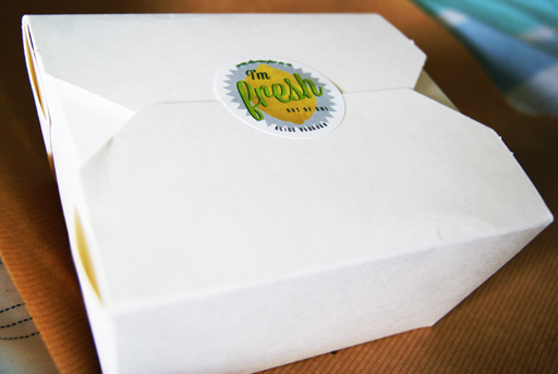
Recently I began my job search by sending out a letter and stickers based on a lemon concept to various companies (see it here). I wanted to create a campaign to send to these design agencies so that I would stand out from what I expect would be thousands of other potential candidates.
The campaign was based around lemons with "I'm fresh out of university" being the main tag line on the stickers along with lemon illustrations and some lemon based puns. Luckily, I did get some response to my letters but to ensure these companies didn't forget me I began part two of the "I'm Fresh" campaign and sent out another package.
The new package had to be bold, interesting and attention grabbing. To achieve these criteria I wrote another letter, included a CV, more stickers and a lemon then neatly packed it into a box and sent it off yesterday evening by special delivery. Hopefully they will arrive on somebody's desk sometime today.
I spent a lot of time and effort getting this package to look right and i'm hoping this is reflected.


Tuesday, August 21
Found Designs #3
Following previous posts along a similar theme (see here & here) I have collated more of my iPhone photos into a "Found Designs" blog post. These posts, as implied, are interesting illustrations, packaging and typography examples I have found while out and about.

My favourite designs here are a postcard from Aberystwyth using old style typefaces with an impressionist style painting to give a suggestion of the vintage sea side era.
A beautiful typeface on a memorial plaque I came across while walking my dog.
Interesting packaging design for some chocolates. The box uses foils to give the box a sense of luxury in contrast with a modern style of the package and typography.
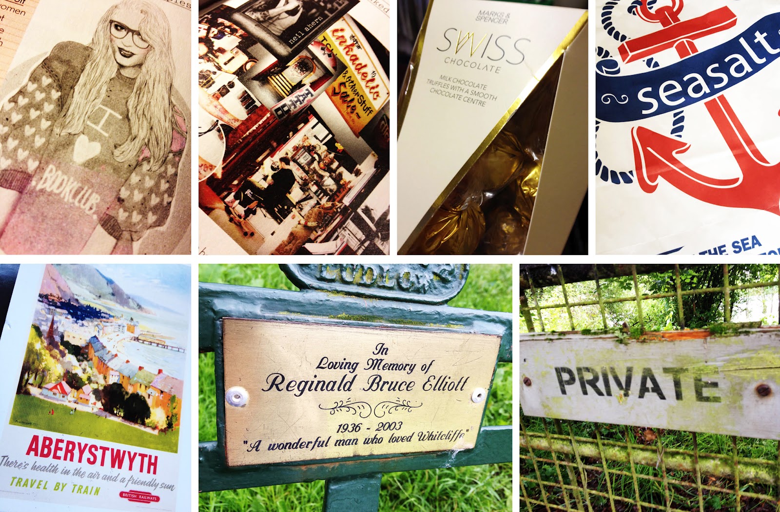
My favourite designs here are a postcard from Aberystwyth using old style typefaces with an impressionist style painting to give a suggestion of the vintage sea side era.
A beautiful typeface on a memorial plaque I came across while walking my dog.
Interesting packaging design for some chocolates. The box uses foils to give the box a sense of luxury in contrast with a modern style of the package and typography.
Monday, July 23
Self Promotion: Society 6
If you read this blog you will know a few things about me; firstly, that I have just graduated with a degree in graphic design and secondly, I am looking for a job within this industry. In pursuit of a job I have made a conscious effort to promote myself to a wider audience through my website, this blog and my twitter account, hoping that the right audience will find me.
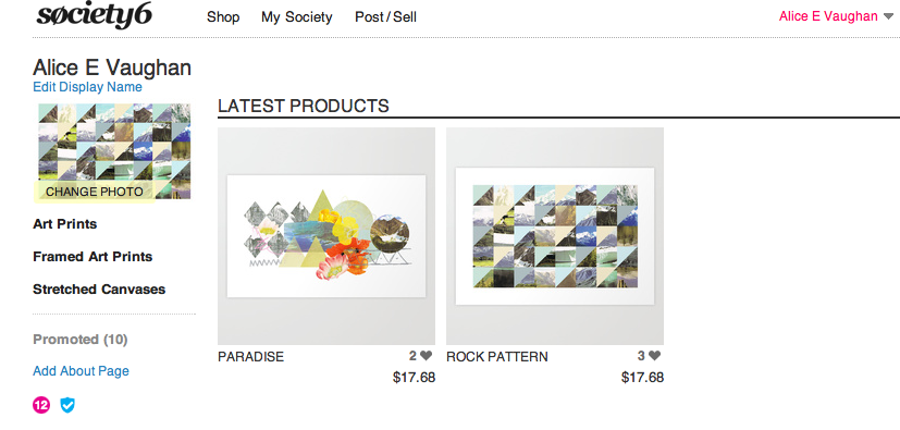
Today I added to my self promotional channels by setting up a Society 6 account under the name "Alice E Vaughan", the same as my twitter account. If you don't know, Society 6 is a web based company where designers and artists post their work on the site and Society 6 makes it into prints/iphone cases/canvases ect. All you have to do is set your profit per item and advertise all your designs. Members of the site can also "promote" your work, similar to the "like" button function on Facebook.
Being a relative newbie to the whole process I have only uploaded two prints, which have both featured on this blog before, as a trial run. The whole concept of my own Society 6 account is an experiment in promotion and pricing my own work. I am hoping to add more prints and designs after becoming more knowledgeable about the process, so keep posted.
If you would like to see my work or buy a print you can now do so here!

Today I added to my self promotional channels by setting up a Society 6 account under the name "Alice E Vaughan", the same as my twitter account. If you don't know, Society 6 is a web based company where designers and artists post their work on the site and Society 6 makes it into prints/iphone cases/canvases ect. All you have to do is set your profit per item and advertise all your designs. Members of the site can also "promote" your work, similar to the "like" button function on Facebook.
Being a relative newbie to the whole process I have only uploaded two prints, which have both featured on this blog before, as a trial run. The whole concept of my own Society 6 account is an experiment in promotion and pricing my own work. I am hoping to add more prints and designs after becoming more knowledgeable about the process, so keep posted.
If you would like to see my work or buy a print you can now do so here!
Saturday, July 21
Self Promotional Illustration
For a while I have been debating on wether to change my blog from dynamic view (how it is at present) to simple view which would allow me much more freedom over the layout. I really like the dynamic view as it prioritises images to make the home page visually exciting, and, of course, it's very user friendly. But, there is a lot of restriction in terms of personalising the page.
I decided to create an illustrative piece that will act as a header for the blog for two reasons. Firstly because the illustration could work as my new header bar for my blog when viewed in mobile and secondly, I really enjoy creating this style of illustration so it's no hardship to spend time doing so.
While I am preparing my blog, website and CV for job applications I am really keen to put my own personal stamp on every aspect of my web presence; and this header could be enough of a feature to achieve this and made me stand out from the crowd.
These are some images of the print out and then on my blog viewed through my mobile.


I decided to create an illustrative piece that will act as a header for the blog for two reasons. Firstly because the illustration could work as my new header bar for my blog when viewed in mobile and secondly, I really enjoy creating this style of illustration so it's no hardship to spend time doing so.
While I am preparing my blog, website and CV for job applications I am really keen to put my own personal stamp on every aspect of my web presence; and this header could be enough of a feature to achieve this and made me stand out from the crowd.
These are some images of the print out and then on my blog viewed through my mobile.


Subscribe to:
Posts (Atom)