photo imfresh2_zpsd65868bc.jpg  photo untitledcollection_zps84a740fd.jpg  photo phunk_zpsb7e679f8.jpg  photo havenbrochurecollectivecopy_zpsbcef5f41.png  photo rubanimages_zps7ead41bd.jpg  photo exhibinpractise_zps178c39b5.png  photo finishedruban_zpsd1229a75.jpg  photo tips_zps509f1619.jpg  photo degreeshowopening_zps0f4801ea.jpg  photo lemonstickers2_zps6d8fb7e9.jpg  photo interviewtips_zps56764e69.jpg  photo placement_zpsb679140e.jpg  photo graduation_zps13fcb4f1.jpg
Showing posts with label Vector. Show all posts

Saturday, February 2

Interview Creative Brief

As this post title would suggest this is about the creative brief I worked on as part of my application for the job at The Air Ambulance Service. Luckily I got the job so decided to share my efforts at this design task :)

The interviewers positively encouraged a creative outlook on this brief which which was so refreshing as it allowed a lot of freedom which is always exciting.

The brief itself was to design a postcard for the TAAS promoting the benefits of longer hours of sunlight in the summer months in regards to the air ambulance operating longer. I decided to go for an illustrative style as it was such a departure from the existing style of TAAS and I could really put my stamp on it. The concept is quite humorous and adds an element of fun, which moves away from the more shocking tactics of some charities.

This are my versions, one for TAAS and one for The Children's Air Ambulance.


Monday, October 22

Fashion Brief

I have been having a bit of a blog break recently as applying for jobs doesn't make for very interesting reading and I'm starting to bore myself talking and obsessing over applications, emails and CVs. Although I haven't been actively seeking employment for a really long time (about two months) it certainly can be demoralising when people don't call back and you need to come up with renewed enthusiasm.

With this in mind I was very pleasantly surprised to find an email in my inbox last week asking me to participate in a brief as part of the interview process for a well known clothing company that were known for their boots (which I now want a pair of) and their links to New England. The brief was to creative five t-shirt designs, two heritage themed and two illustrative "earth keeper" designs that related to the importance of the environment.

The brief sounded perfect as the heritage part of the brief was typography based and influenced by vintage signage, two things I really like and use in my own work. So I set to work researching, sketching and coming up with some designs that would reflect the nature of the company; something I could visualise on their t-shirts.

With this brief I tried to give the "client" what they wanted and reflected their company and then some designs that were a little more outside their comfort zone in the "earth keeper" illustrations as I was encouraged to be a bit more inventive. The deadline was this morning so I sent a PDF of the designs and explanations to the company last night, I think the designs I created were suitable and creative but wether I'll be invited to go further in the interview process? I'm not sure.

Anyway, here are a few pictures of the designs and works in progress.


Tuesday, August 21

Found Designs #3

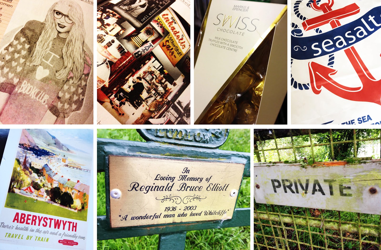
Following previous posts along a similar theme (see here & here) I have collated more of my iPhone photos into a "Found Designs" blog post. These posts, as implied, are interesting illustrations, packaging and typography examples I have found while out and about.


My favourite designs here are a postcard from Aberystwyth using old style typefaces with an impressionist style painting to give a suggestion of the vintage sea side era.

A beautiful typeface on a memorial plaque I came across while walking my dog.

Interesting packaging design for some chocolates. The box uses foils to give the box a sense of luxury in contrast with a modern style of the package and typography.


Wednesday, July 18

Prima Oliva Branding

A friend recently approached me about helping him rebrand his company; Prima Oliva. The company makes and sells specialist olive oils to wholesalers, restaurants and pubs. The brief was quite open so there were plenty of avenues to research and explore first. After some research and developing a logo I came up with this.

The new design takes reference from traditional olive oil bottles and street sinage, combined with a clean style to give a modern and sophisticated approach. The colour palette was key to make the new branding relevant to the company as the light greens and yellows can be associated with the olives, olive trees and the oil. 

This is a super quick mockup of some potential letter heads, business cards and compliments slips that will create a clean and consistent brand for the company.


Tuesday, January 3

Vector Web Images

As part of a collaboration with other departments of the university I have been making some vector based illustrations for a uni run web project. The illustrations are intended to convey the purpose of the web project and what services they can offer customers. Initially, it was quite hard to show some of the more complex areas of the company, such as content management systems, but hopefully this has been achieved. This is the progress I have made with the project so far. 

Content Management Systems
Web Devlopment
App Development
Web Systems